A Better Way to Brand Your Call-to-Action Buttons
How to increase button accessibility
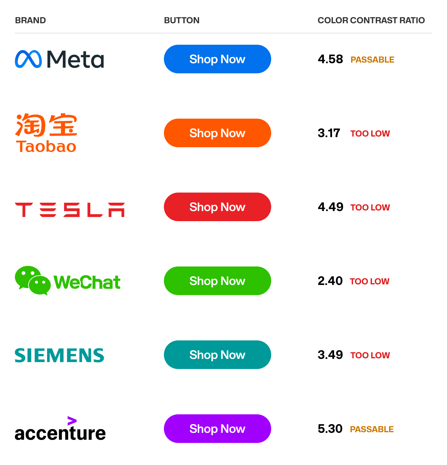
How do you design a call-to-action button for your brand? Most designers apply their brand's accent color to the button surface and add white text. These accent color buttons are all over the web. However, this approach leads to buttons that are inaccessible and have too low color contrast.
Not only that but sometimes the accent color is too bright and saturated. As a result, it can be a jarring eyesore to look at. Fortunately, there's a better way to brand your call-to-action buttons to give your users a more pleasant result.