A Better Way to Display Data Rows
Improving traditional data display
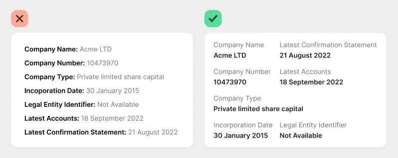
Displaying data on interfaces is not as easy as you think. It's not enough to show rows of data to users. You have to do it in a way that's easy to read and scan at a glance.
Many designers fail at this because they make the following mistakes:
They prioritize the header over the data.
They use a left-aligned layout.
The way to improve your data display is to do the opposite. Prioritize the data over the header and use a top-aligned layout.

