Card Slicing: A Simple Method for Designing Better Grid Layouts
Breaking free from basic grids
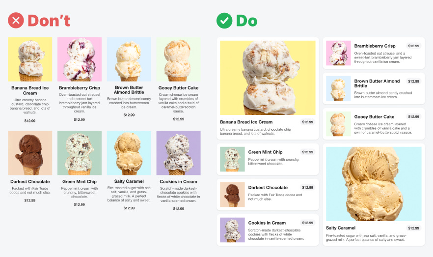
Most designers use a basic grid for their page layout. The grid displays content in boxes that are all uniform in size, shape, and style. However, this doesn't always give the best user experience. To create a more appealing and engaging layout, you should use the card slicing method.
A drawback of basic grids is that they can overwhelm users with too much text. Each content item is confined to a narrow column, causing the text to stack and wrap. This creates a crowded space that makes reading difficult.
The uniform style of the content doesn't grab the user's attention right away. As a result, users tend to browse the page in a linear fashion, going through each row of items in sequence. This browsing approach takes away the fun and exploratory aspect of the experience.

