How do you visually distinguish headings from paragraphs on an interface? Titles from subtitles? Data from metadata? Today, many designers use light gray text for contrast but don't realize they're making their text unreadable.
Users have to strain and work harder to read light gray text. This extra effort could involve moving their eyes closer to the screen, squinting their eyes, or increasing their browser's font size.
Whatever the case may be, light gray text causes readability issues and isn't optimal. It's good to distinguish different text to help users scan, but designers need to change how they do it.
Working with grays isn't easy. It's hard to find a specific gray value that works for every case. Even darkening a light gray can sometimes be too much or not enough. The balance is hard to determine because every designer's perspective is relative.
A more reliable approach is to use a light font-weight on secondary text, such as subtitles, captions, and metadata. Using a light font-weight means you don't have to mess with the color value. You can use a dark shade and get the same effect as a light gray.
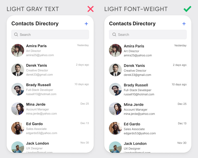
The example shows the difference between light gray text and light font-weight text when applied to metadata. Notice how the light gray text looks faint and ashy. Most designers treat their text this way because they don't know how light of a gray is too light.
Designers don't need to meddle in the gray area with a light font-weight. They can use any dark shade, and the text will maintain its contrast. Notice how the metadata is softened but readable. The light font-weight text looks sharper and crisper than the light gray text.
Not all fonts offer a light font-weight, so you'll have to pick a font that does. If you're using an old, outdated font, it's time to update to a better one. Here are a few free, high-quality fonts to choose from:
Read the Premium Article
You're currently reading the free article. Subscribe to the UX Movement newsletter to read the premium article on how to optimize your text using the font-weight system.


