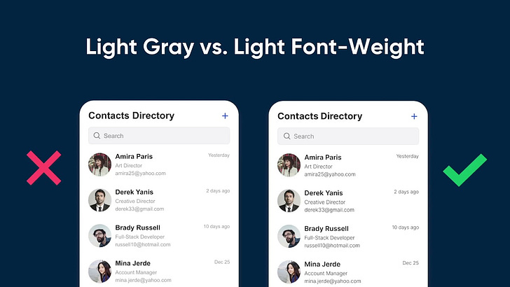
It’s a new year and the perfect time to start using font-weight correctly on your text. Stop using light gray for secondary text and the same bold font on every heading. Learn how to use font-weight to improve text readability in this video.
This video is based off the following articles:
Subscribe to the channel and share the video with your colleagues and friends. Happy new year.


