Choosing colors for your interface is easy if you base it on your aesthetic taste. However, your favorite colors may not always be accessible to your users. Choosing aesthetically accessible colors is quite hard.
To provide an optimal user experience, you have to consider those who suffer from visual impairments such as low vision and color blindness. They need to read and use your interface without pain or strain.
The challenge here is to balance your aesthetic taste with accessibility to get the best of both worlds. To achieve this, you have to create a color system that’s optimized for UI design.
A Practical Color System
Most designers will open a color picker or palette and choose their colors arbitrarily. This is a huge mistake that will result in inconsistent accessibility across UI elements and components. Choosing colors based on emotional whims won’t accord with accessibility because accessible colors follow a standard.
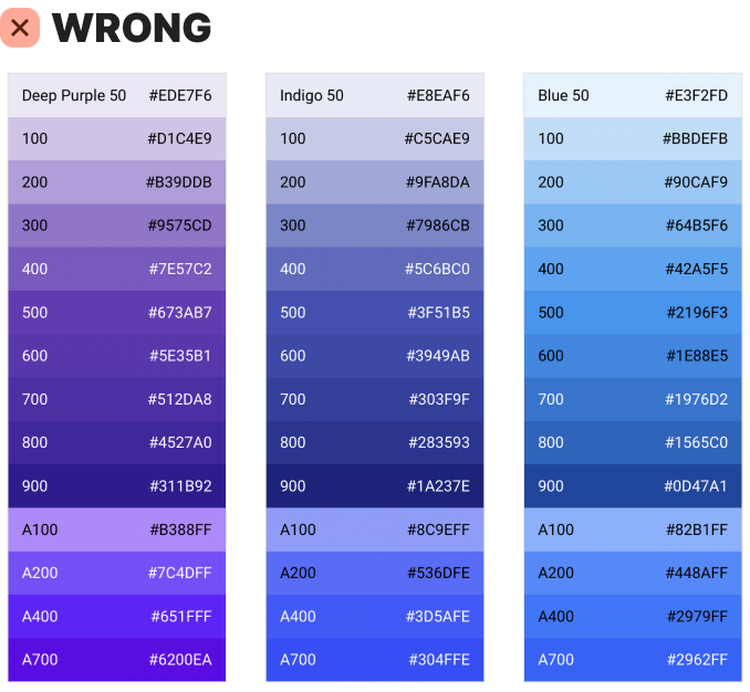
Another mistake is failing to assign a role to each color name. Instead, they’ll give each color a number to make room for many tones that rarely get used.
Doing this creates unnecessary bloat in your color system and can hurt the user experience. It gives room for designers to use the colors haphazardly without considering their role or purpose.
Each color you choose should serve a particular purpose for the UI. Instead of using numbers to accommodate excess tones, assign a practical role name to your colors. Then consistently use those colors based on their roles.
You can divide all UI colors into neutrals and accents. Neutral colors are for most elements that make up the interface, such as text and surfaces. They don’t have an intense hue because they don’t require a high amount of attention.
On the other hand, accent colors contain an intense hue because they demand more attention. They’re used to communicate interface actions and states that users need to be more aware of.


