
How to Design a Sidebar That Saves Screen Space
Anatomy of a collapsible sidebar
Screen space on a desktop interface is more important than you think. Most designers take it for granted because a desktop screen contains so much space. However, when it comes to data display, every pixel counts.
A sidebar can occupy a lot of width space and diminish the content area. As a result, users will view less data per visual fixation, which can lead to a compact and crowded viewing experience. If you have a data-dense interface, this is far from ideal.
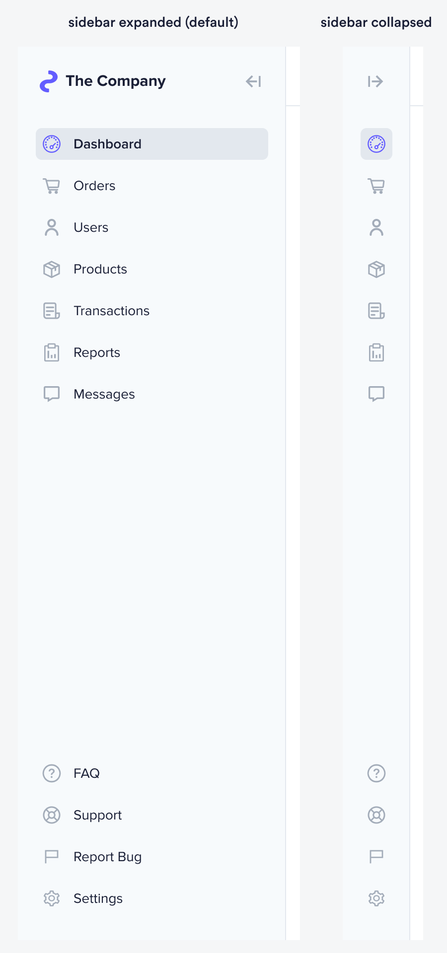
Designing a collapsible sidebar can provide users with a better data viewing experience. With just a click, the user can push the navigation out of the way and free up more width space for content.
As a result, users can consume more information with less scanning and eye movement. Not only that, but they'll get a richer widescreen view of images and videos. But to pull this off, you must design your sidebar correctly.