Before users view your content, you need to spark their interest. Content cards are the perfect component for this.
However, many designers fail to design content cards correctly. Instead of teasing users, they overwhelm them with too much information. As a result, users spend too much time reading and have trouble making decisions.
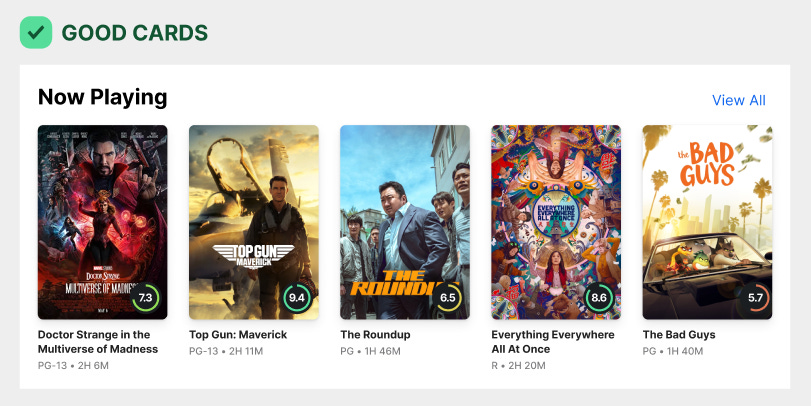
You should be picky with what you display on your content cards. If you were to design them optimally, it would look more like the example below.
The content cards tease users to get them to click by shedding off the unnecessary extra data. Not only that, but it emphasizes the critical data that users need to make a decision.


