Data tables aren't like any other UI component. They not only display detailed information, but they also allow users to act on it. However, taking action isn't easy when each table row has many available options.
How do you display them all without overwhelming users? How do you fit them all without a wide layout that pushes other columns out of view? If all you're doing is arranging the action buttons horizontally, your UX will suffer.
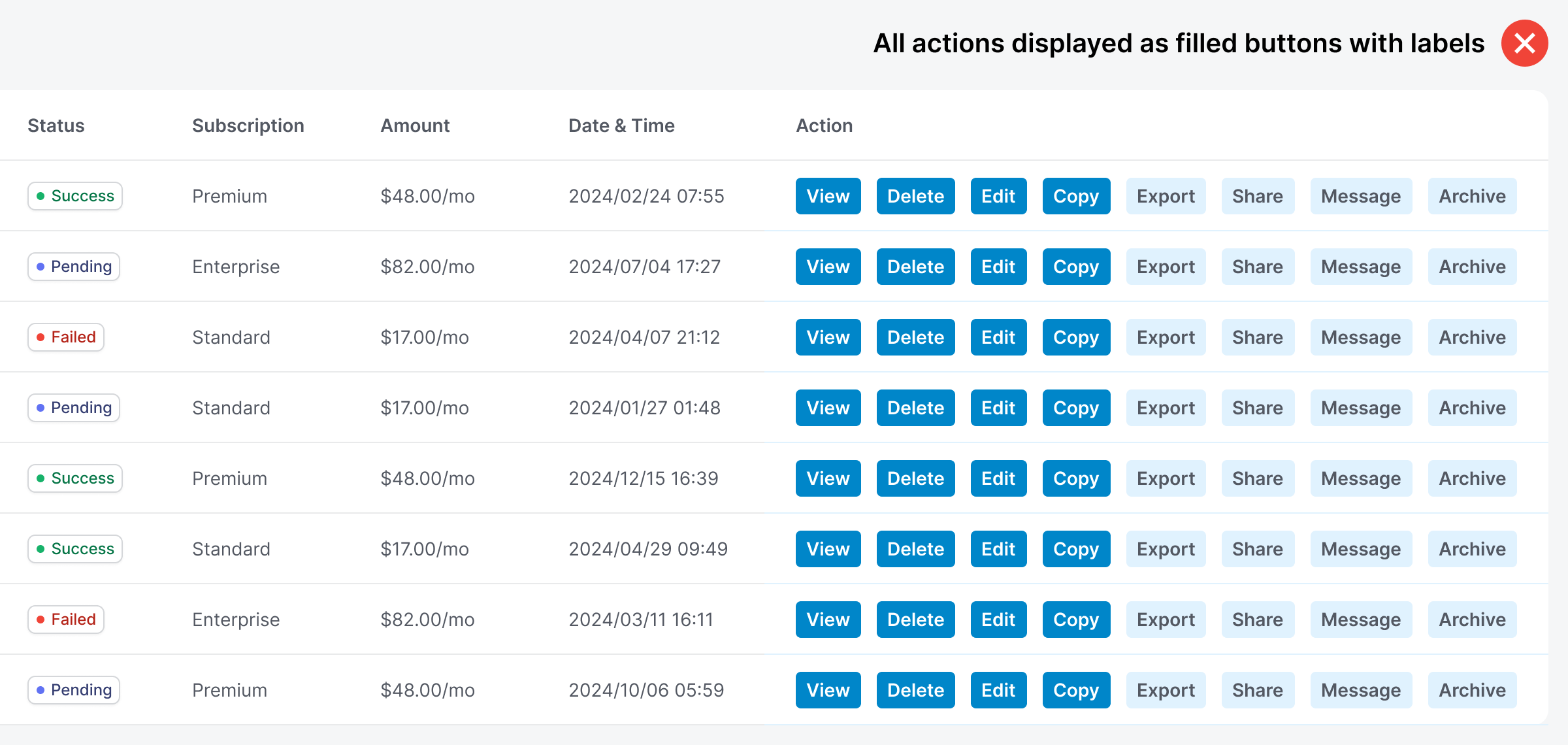
Imagine there are eight action buttons for each table row. Reading the labels and choosing a specific action will take much time and cognitive effort. This design is the wrong way to display multiple table actions.