How to Make Your Data Tables More Visual
The secret to visual data tables
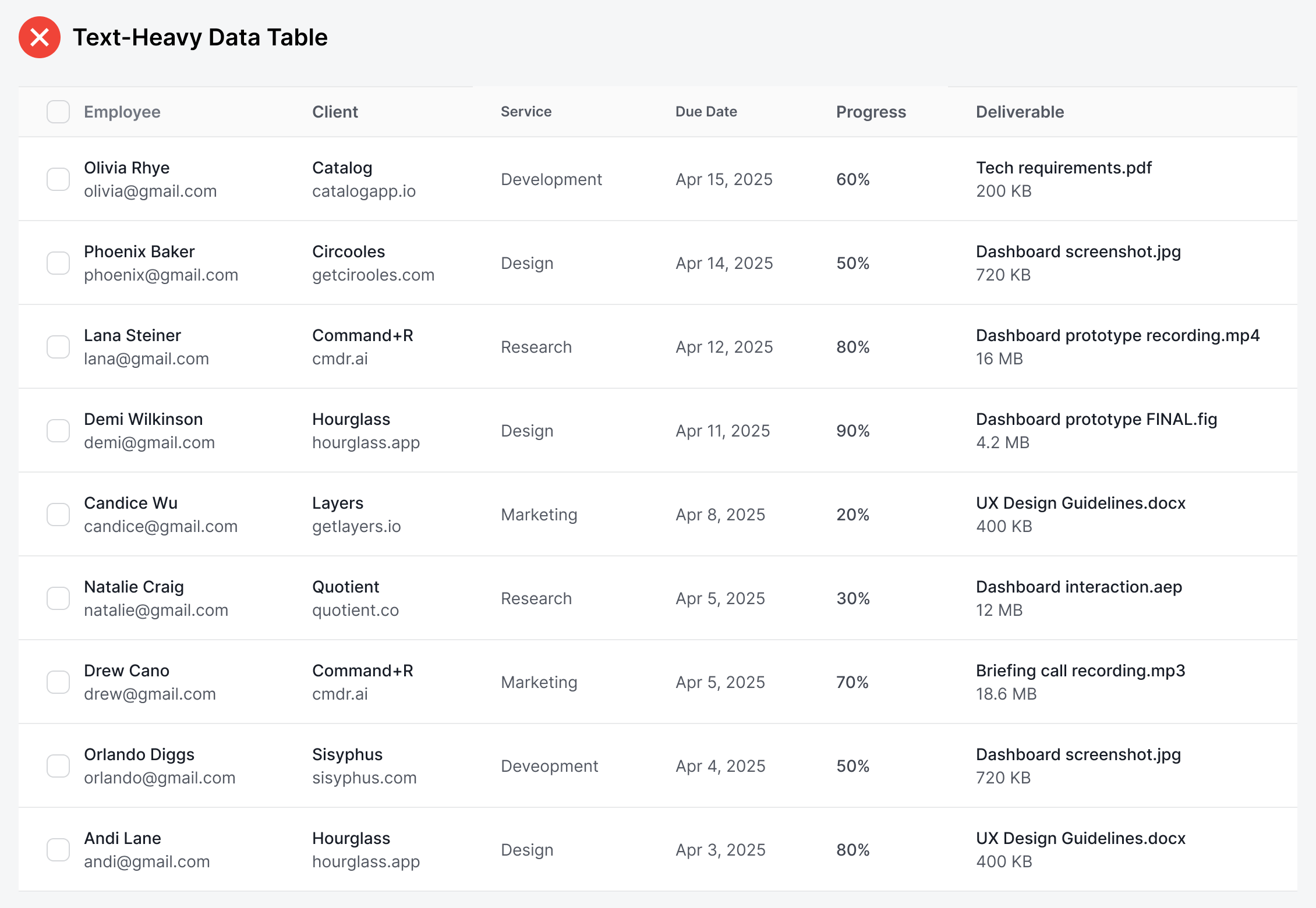
Almost every data table you've ever seen looks the same. They consist of many rows and columns filled with lots of text. Text-heavy tables like this don't offer the best user experience because they're missing one crucial aspect—visual elements.
Your data table needs to be more visual to make different data points easier to scan and identify. It also needs to look appealing so that users look forward to using it. An effective technique for this is to add visual elements to identity-based data.