How to Optimize Your Sidebar Menu for High Usability
The Four Usability Areas for Sidebars
Sidebar menus are the perfect navigation component for web applications. They take full advantage of the desktop screen’s width space so that users can navigate easier.
Having a sidebar menu isn’t enough for a great user experience. You also have to optimize it for high usability. Most designers don’t know how to do this because they haven’t considered these four areas for designing an optimal navigation.
Recognition
Touchability
Scannability
Screen Space
Once you optimize your sidebar menu in these areas, you’ll have an optimal navigation that’s a pleasure to use. Here’s what you need to do to achieve this.
Optimizing for Recognition
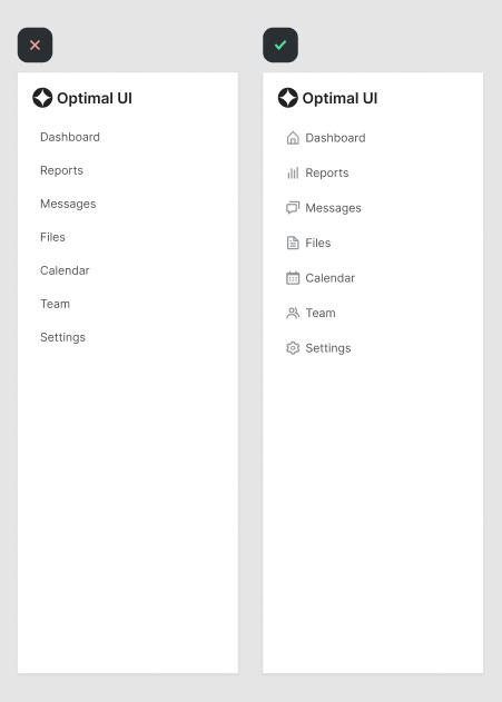
Before users can click a menu item, they have to read the text labels. However, you can make each item easier to recognize by using simple and clear icons. This way, when users scan the menu, they’ll recognize items by the icon before they read the label.
As users use the menu more and more, they’ll associate each icon with its assigned menu item and be able to find items faster. Make sure the icons are simple and clear so users can recognize its meaning at a glance.