
How to Revive Dead Content with This Card Layout
Good vs Bad Card Design
Do you struggle getting users to view and understand your content? A common culprit of this is the layout. Your layout determines how easily users can find and process information. By improving it, you can dramatically enhance the user experience and bring your content to life.
Most apps contain dead content that users don't even want to look at. Instead of exploring the different pages and categories, they prefer to use the search bar. One reason for this is that the layout is too challenging to scan and visually unappealing.
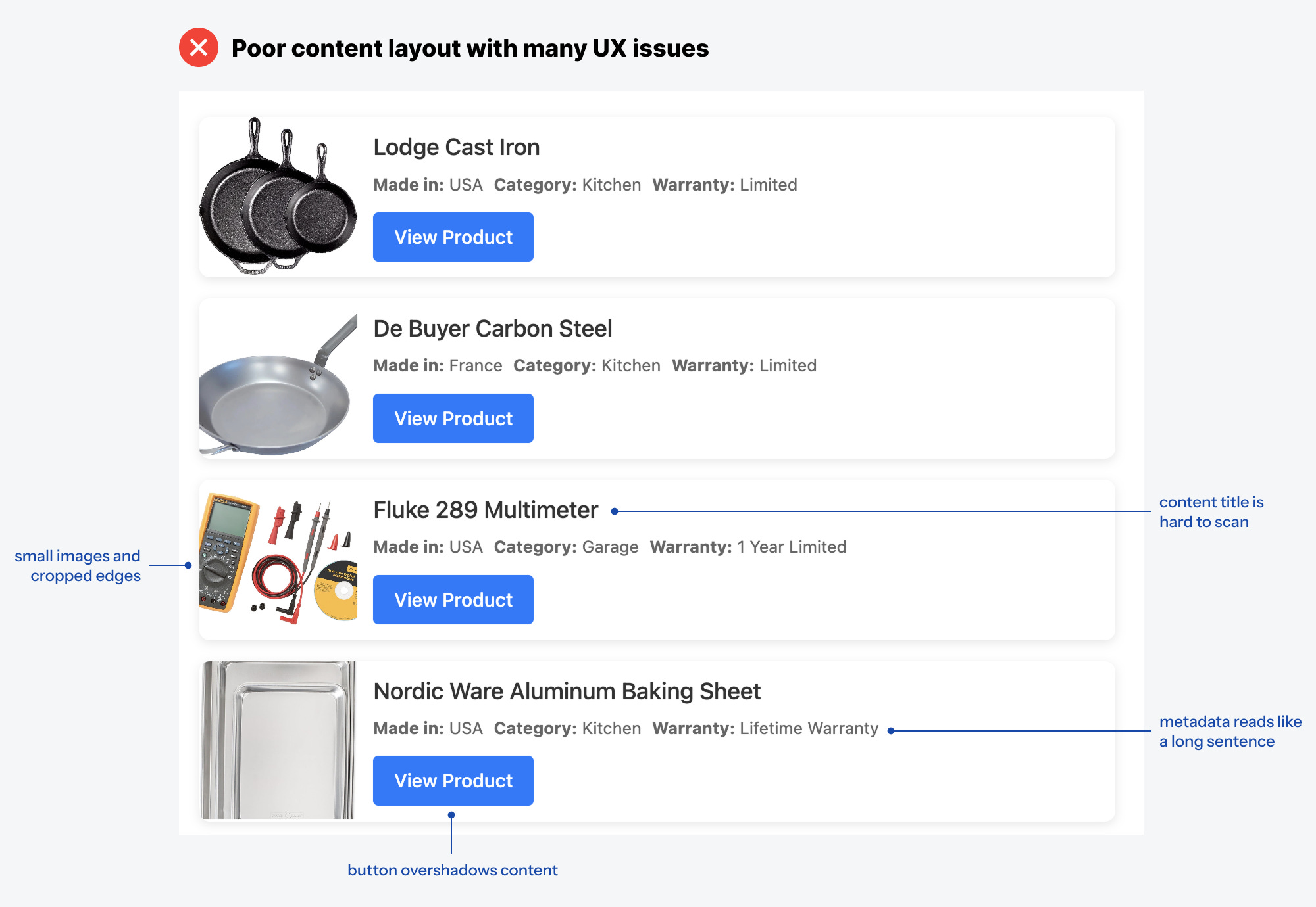
Without a proper card layout, your content will continue to suffer. Here's an example of how not to design a card layout. Notice how the button dominates the visuals and overshadows the information. The thumbnails are small and cropped on the edges. The title is difficult to scan, and the metadata reads like one long sentence.