How to Signify Toggle Button States Without Color
Eliminate toggle state ambiguity
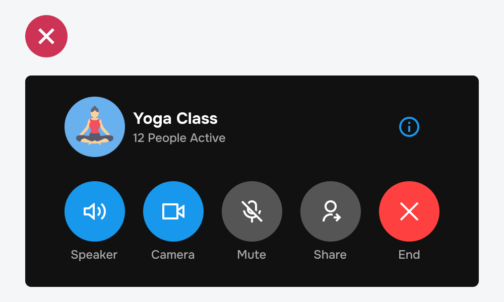
The biggest UX problem with toggle button design is state ambiguity. No matter what designers do, users never know whether a toggle is on or off. The reason for this is the sole use of color to differentiate the states.
Designers often use color to signify active toggle buttons. However, this creates confusion if it competes with other elements of the same color. The example shows blue toggle buttons with other blue elements on the screen. It's unclear whether the blue indicates a binary state or regular action buttons.
In addition, the blue buttons also compete with other buttons that have color, such as the red button. There's so much visual noise that it's hard for users to process the interface cognitively.