
How to Simplify a Confusing 65 Item Mega Menu
Design a faster navigation
How would you design a menu for a complex website with many categories and subcategories? Most designers would use a mega menu that displays all the items in a large, comprehensive list. However, this approach is not as user-friendly as you'd think.
To demonstrate, here's a mega menu that displays 65 items in 8 categories. Try to find the "Speakers" item in the menu and note how long it takes.
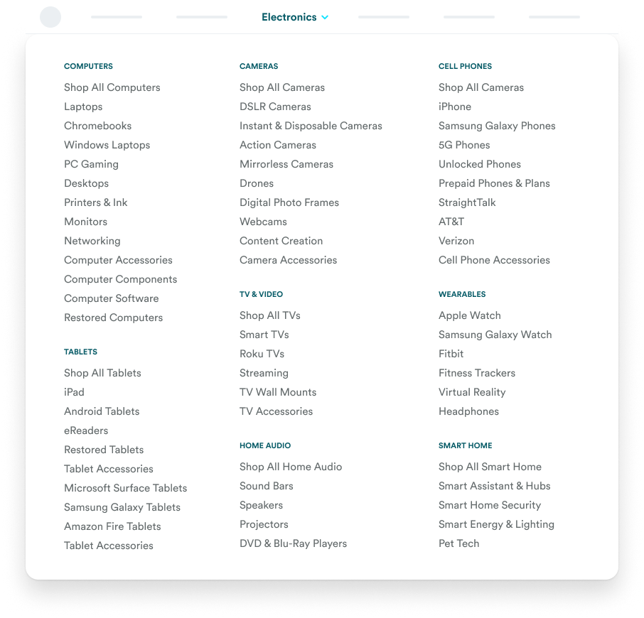
Chances are it took more time and effort than expected. You likely scanned through multiple lists until you stumbled upon the item. Mega menus are confusing and hard to use because they require too much scanning.