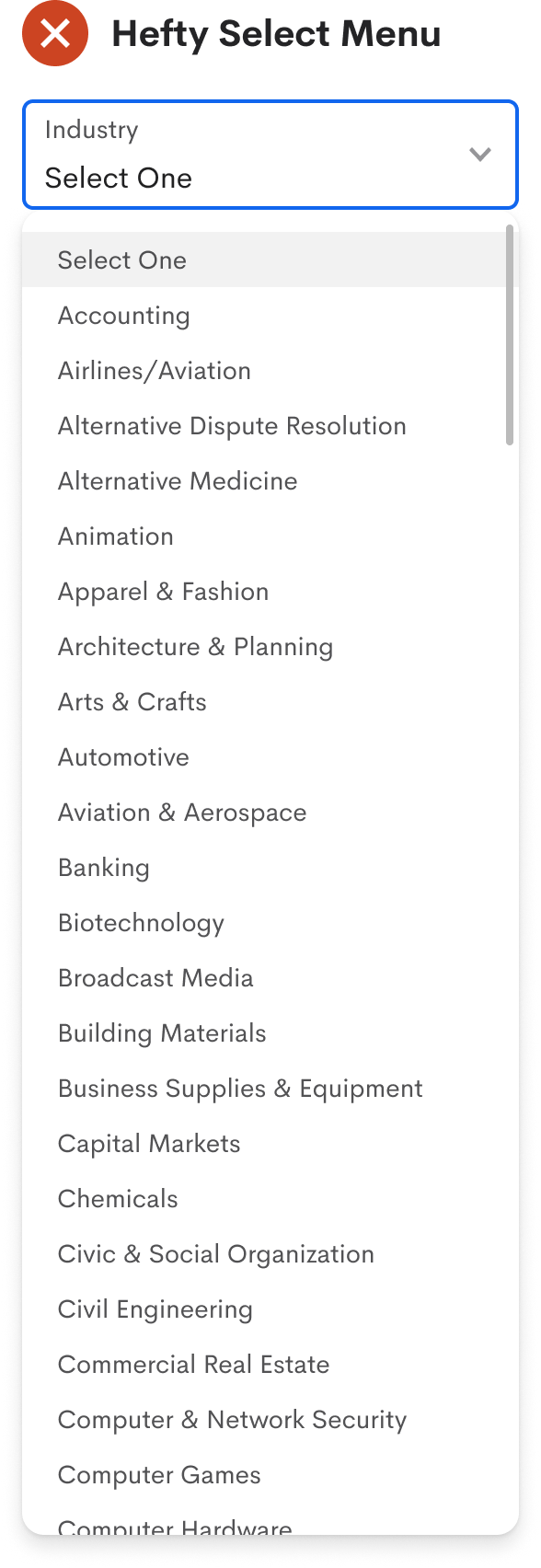
How to Simplify a Hefty Select Menu with 147 Options
Reduce long menu scrolling
Imagine filling out a form and coming across a select menu with a hundred options. Now, you must scan and scroll through it to find the right option to select.
You scroll down the list but accidentally scroll too far. Now you scroll back up but overshoot. While scrolling, you lose focus on the option and scan the list again. Finally, you find and select it. That took more work than any of the previous fields you filled out.
Many users experience this when they run into hefty select menus. As a UX designer, you must reduce the time and effort to choose an option. Scrolling through a long menu list isn't going to cut it.

