UX Movement Newsletter

UX Movement Newsletter

Share this post

UX Movement Newsletter
How to Simplify a Settings Screen with 45 Buttons

How to Simplify a Settings Screen with 45 Buttons

Streamline complexity with a visual scale

Sep 11, 2024
∙ Paid
25

Share this post

UX Movement Newsletter
How to Simplify a Settings Screen with 45 Buttons
6
3
Share

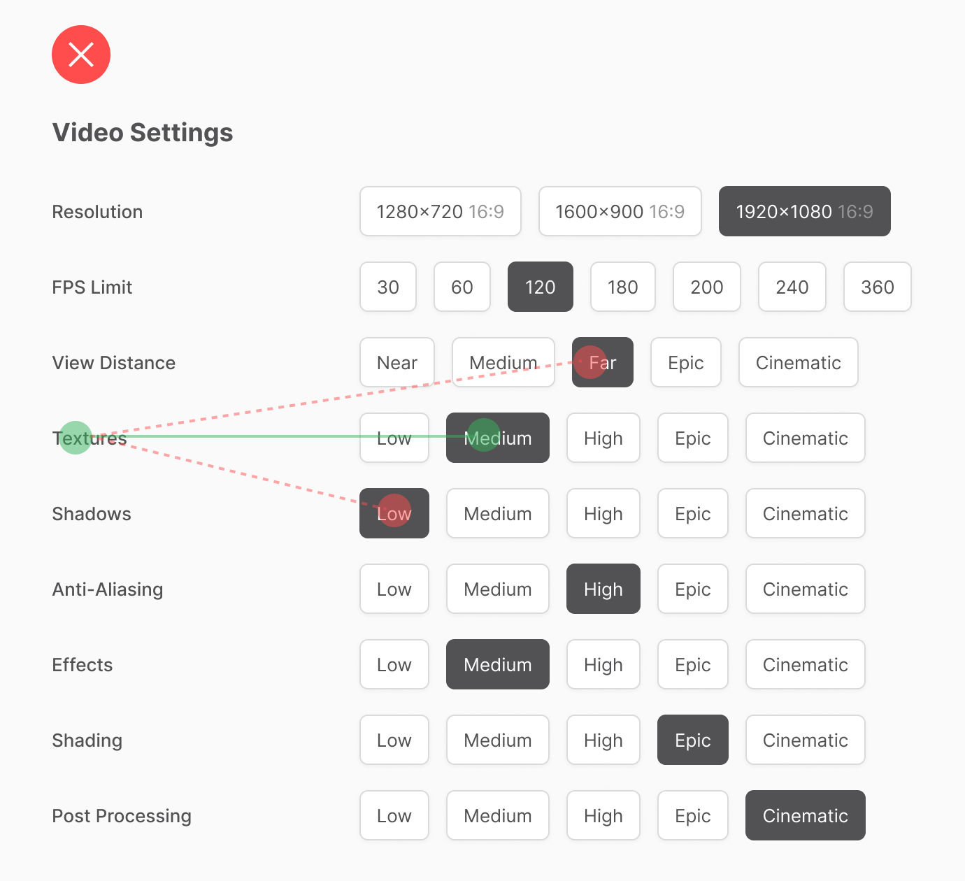
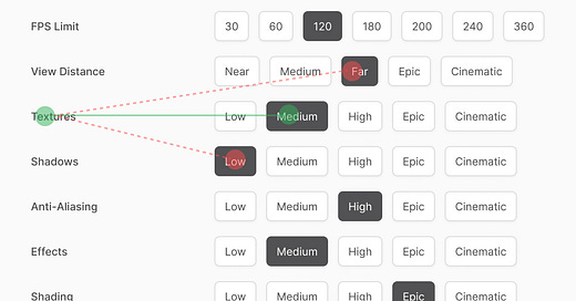
Picture a settings screen with 45 different options. Every option is a horizontally aligned button that users can choose from. However, viewing everything at once is overwhelming and creates a lot of clutter. As a result, specific options are harder to find, and current settings are harder to track.

The settings labels are on the left, and the options are on the right. When users scan across the options, they need to move their eyes in perfectly straight lines. Should their gaze veer too low or high, they'll mistake their current setting for the wrong one.

This post is for paid subscribers

Already a paid subscriber? Sign in
© 2025 Anthony from UX Movement
Privacy ∙ Terms ∙ Collection notice
Start writingGet the app
Substack is the home for great culture

Share