How to Simplify the Most Complex Data Sort
Design for better data sorting
Your interface might display data well, but does it sort the data in a user-friendly way? Most data sorts have a poor user experience because designers don't give them much thought.
As a result, users must spend more time scanning and sifting through loads of information. Instead of finding the desired data on the first page of the results, they have to fiddle with the pagination.
A data sort should lead users to the information they want in a single click and on the first page. To achieve this, make the following design changes to your data sort.
Use Relatable Label Language
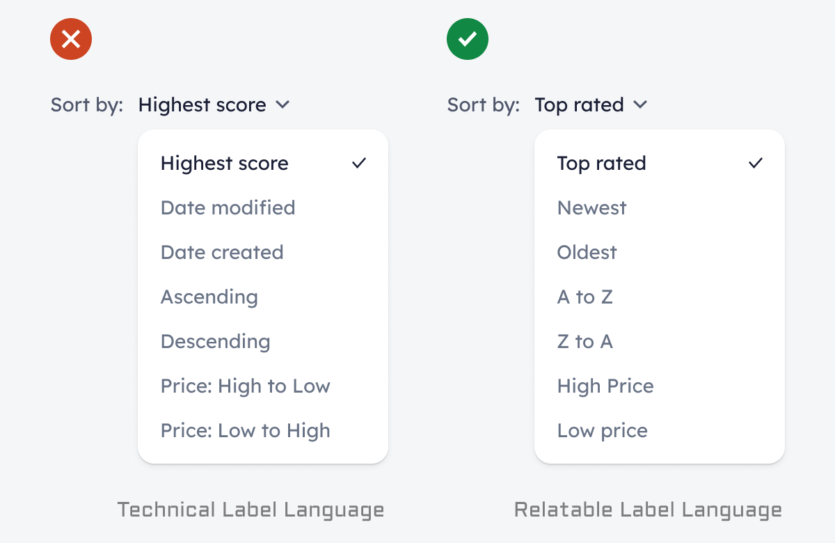
One thing every data sort must have are labels with human-relatable terms. Too often, designers use labels with technical jargon that demand cognitive effort to understand. In other words, users need to stop and think about the meaning of words before they can act.
The bad example on the left shows labels that use technical language, such as how a system would define it. A better approach is to choose terms that users would use to describe the data to another person. They would speak in a more relatable tone, such as the good example on the right.


