UX Movement Newsletter

UX Movement Newsletter

Share this post

UX Movement Newsletter
How to Simplify the Most Complex 3-Level Navigation

How to Simplify the Most Complex 3-Level Navigation

A better sidebar for large-scale apps

Sep 03, 2024
∙ Paid
20

Share this post

UX Movement Newsletter
How to Simplify the Most Complex 3-Level Navigation
Share

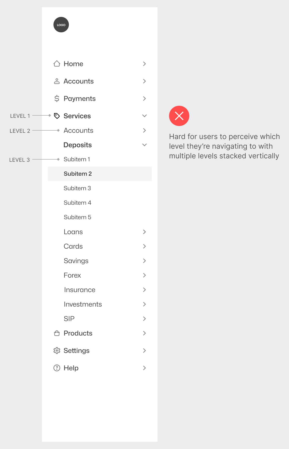
A one or two-level navigation isn't too hard to design. However, a three-level navigation presents extra complexity and challenging UX issues. For one, it isn't easy for users to perceive which level they're navigating to when every level is vertically stacked.

Since all the levels are in close proximity, there isn't much visual distinction between them. Expanding a level 2 item looks like you're expanding a level 1 item and vice versa. As a result, users must constantly check if they're on the right level when navigating.

This post is for paid subscribers

Already a paid subscriber? Sign in
© 2025 Anthony from UX Movement
Privacy ∙ Terms ∙ Collection notice
Start writingGet the app
Substack is the home for great culture

Share