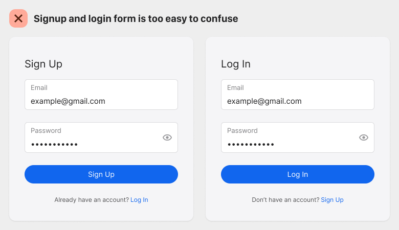
Most signup and login forms look identical. They contain a couple of fields, some text, and a button. Their similar appearance can sometimes confuse users into filling out the wrong form.
The user will accidentally fill out the signup form with the intent of logging in or vice versa. After entering their credentials, they soon realize they're on the wrong form. This confusion leads to errors and wasted effort.