
How to Use Surface Elevation to Elevate Your Interface
The right way to use drop shadows
All user interfaces are a collection of surfaces. You have the background, foreground, and the elements that float on top. To show users what screen elements are active, you have to use surface elevation.
Some components that need elevation are toasts, cards, and menus. When you fail to use elevation, these components can look like they are part of the background or content. As a result, users can overlook them and fail to interact with them promptly.
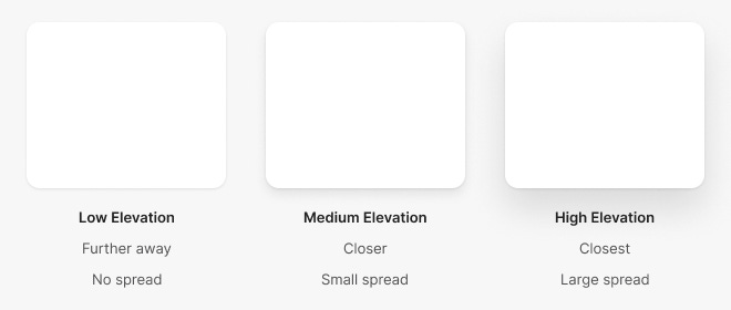
Your interface needs three levels of elevation: Low, Medium, and High. These elevations vary by the spread of their drop shadow.
Notice how the spread of the high elevation shadow is larger than the medium and low elevation ones. This spread mimics shadow elevation in the real world. Users prefer shadows that look natural, so make sure they’re subtle and realistic (article).