UX Movement Newsletter

UX Movement Newsletter

Share this post

UX Movement Newsletter
Modal Slideouts vs Popups: The Right Choice for Better UX
Copy link
Facebook
Email
Notes
More

Modal Slideouts vs Popups: The Right Choice for Better UX

When to use which modal type

Oct 22, 2024
∙ Paid
24

Share this post

UX Movement Newsletter
Modal Slideouts vs Popups: The Right Choice for Better UX
Copy link
Facebook
Email
Notes
More
7
Share

Does your app use too many modal popups? If you use them for more than confirmation dialogs, it does. Many apps will display a modal popup to complete a task flow. However, this common practice leads to a poor user experience on desktop screens.

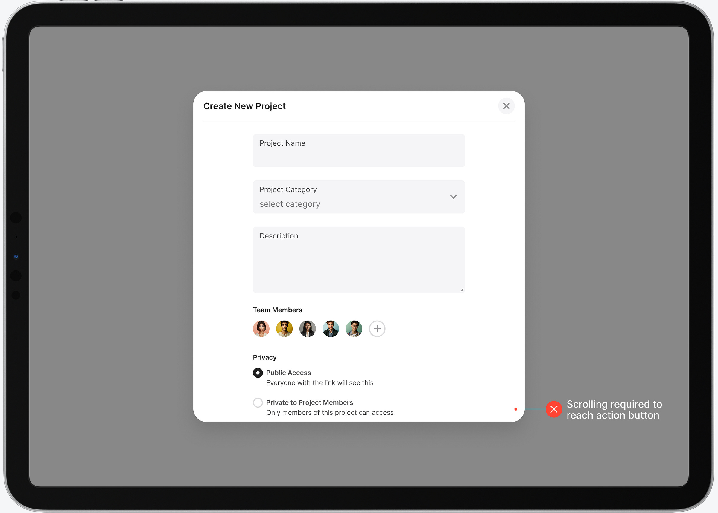
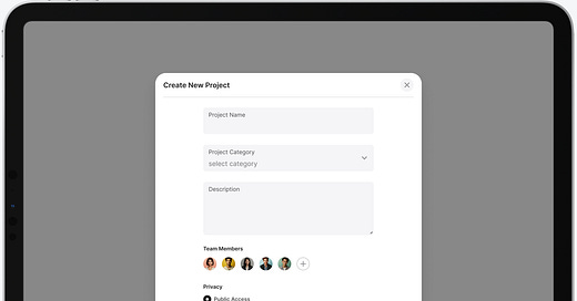
Consider the task flow for creating a new project on an app. When the modal popup displays, not all the elements are in view on the screen. The user must scroll to the bottom to click the action button. This extra work adds more time to the task and decreases efficiency.

This post is for paid subscribers

Already a paid subscriber? Sign in
© 2025 Anthony from UX Movement
Privacy ∙ Terms ∙ Collection notice
Start writingGet the app
Substack is the home for great culture

Share

Copy link
Facebook
Email
Notes
More