
UI kits are a powerful and efficient way to cut production time and maintain a consistent design across apps. But the problem with most of them is that they're full of design bloat and unintuitive components.
They offer way too many component options and style variations that confuse you because you don't know which one is best for the user experience. Not only that, but they use inaccessible colors that are illegible to users and too many colors that clash with the brand you're designing for.
Professional UX designers don't need a variety of useless options. They need the optimal version of each component. No UI kit like this exists until now.
Say goodbye to junk components and say hello to Optimal UI — the most intuitive components all in one kit.
Instead of thinking of all the different ways a component could be designed, I focused on making each component optimal. The result is an insanely intuitive UI kit that makes it fast and easy to create the user experiences you want.
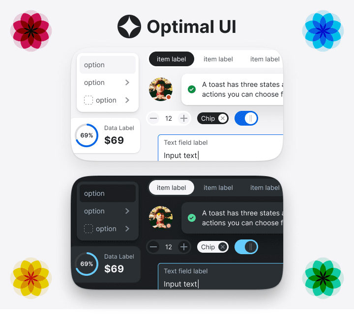
Accessible Out-of-the-Box
One reason why the components are insanely intuitive is their accessibility. All text labels and visual cues are visible, legible, and clear to normal-visioned and visually impaired users—no need to adjust the colors because they're already optimized.
It's not only optimized for a light color theme but a dark color theme too. As a result, you get components that look aesthetically stunning for your light and dark interface modes.
Magical Proportions
Another reason why the components are insanely intuitive is the magical proportions it uses. Optimal UI uses multiples of six to space and size elements in harmony with the golden ratio.

Six is the magic number because it's one of the few numbers where the sum of all its divisors equals the number itself. Any multiple of six divided by two or three will always equal a whole number.
Using magical proportions decreases the visual tension among elements and allows whitespace to breathe through margins. Not only that, but it also sizes elements with optimal padding so that they're easier to touch.
Smart Color Styles
Other UI kits may provide you with hundreds of colors and assign a number to each one, but that's inefficient design bloat because you'll never use them all. They clutter your options to the point where you're not sure which color you should use for an element.

Optimal UI only provides you with the colors you need and will use. Instead of a hundred colors, there are thirteen for the light and dark palette. The colors are all named by their intended usage so that you know how to use them.
The light and dark theme color names mirror each other. This mirroring enables you to convert colors for one theme into another without effort. Just choose the same color name you're using across palettes.
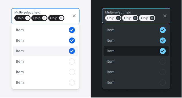
Variants and Auto Layout
Each component has variants that enable you to activate states, icons, and switch sizes or types. Everything you need is baked in and only a few clicks away. You no longer have to design from scratch to modify or enhance a component.

Auto layout is also baked in, enabling you to scale components without breaking the layout. Component frames adapt to the size of their contents so you can add text and other elements without rearranging everything. Padding and alignment of inside elements are easily adjustable.
Developer Friendly
Naming things is one of the hardest tasks as a developer. The components and their siblings are named with a simple structure to make it easy for developers.

Optimal UI is not just for designers but developers who want to mock up their ideas and communicate them to their team. Developers don't need to design anything. Just input content, adjust sizes, and select variants, and done.
Company Team Friendly
Your entire company team can use Optimal UI to create designs on different projects with a consistent design language. When your team communicates with each other, they will refer to components with the proper names to prevent confusion. Your company's products will also have a uniform, standardized look that matches your company brand.
Free Automatic Updates
The current component library will grow and evolve with new components and variants. You'll get free automatic updates through Figma's team libraries. Just review and accept the updates without downloading a thing.
Preview the Components in Figma
Licenses for Teams and Individuals
Standard License (
$129$87)
For a solo designer, developer, freelancer, etc.
Small Team License (
$369$247)
For a small team of up to 6 members.
Big Team License (
$699$477)
For a big team of up to 12 members.
Just bought a license. Looking forward to trying it out on my next project!
Will you support Svelte apps, and not just React?