
Optimize the Color of Grouped Buttons for Task Performance
Making button choices easier
Does your interface have grouped buttons that users have to choose from to do a task? If you're giving each button a unique color, you're making a big UX mistake. The color of your grouped buttons affects task performance
Too Many Button Colors
When you use too many button colors, it visually distracts users as they're trying to make a choice. As they read the button labels, the different colors will interfere with their cognition.
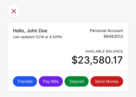
It causes them to wonder what each color means. You might not have any meaning assigned to those colors, but the user doesn't know this. As a result, users have to think more about their button choice.
All the Same Color
It's also not optimal if each button has the same color. The user still has to read each label to determine which button has the action they're seeking. They have to do this every time they view the screen because every button looks the same.
