Payment Flow UX: Selecting a Payment Method
How to reduce checkout friction
Making online payments is a sensitive task for most users. It involves them handing over their money, so any friction along the flow can cause them to abandon the checkout. When designing an online payment flow, you must make the user experience seamless to reduce as much friction as possible.
The first step in the process is selecting a payment method. Many websites get this step wrong because they make design mistakes with the selector component and thirty-party options. Here’s what you need to do to ensure users can easily select their payment method.
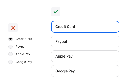
Use custom select cards over native radio buttons
Native radio buttons are hard to click and see. They also do not have a strong selection indicator. Custom select cards have a larger click target and more visibility. The selection indicator has a high-contrast cue that’s clear to see.


