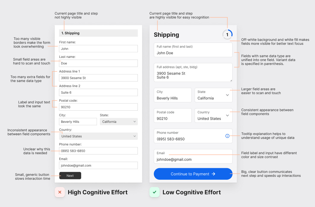
Filling out a form can frustrate anyone if it requires a high cognitive effort. A high cognitive effort causes users to think and work harder, increasing the time to complete the task.
This experience can lead to page abandonment and lower conversion rates on a checkout form. To prevent this, apply these best practices to each checkout page.
Shipping Page
Make page titles and form steps highly visible
When users can see the page title and form step, they'll recognize where they are and what they're doing if their mind slips. Make your titles highly visible by using big, bold font, and make your form steps visible by using a ring stepper.
Make field backgrounds more visible for better focus
Combining an off-white background with a white fill makes text fields more visible. As a result, users can focus on the label and input better.
This practice also reduces the many visible borders that often make a form look overwhelming. With fewer borders, the form looks like less work.
Make touch area for text fields larger
Placing the label and input inside the field increases the size of the text field. As a result, it has a larger touch area for faster touches and interactions. Not only that, but it allows users to scan input and labels simultaneously.
Reduce number of fields by combining similar data
Too many fields will increase the user's cognitive load. By reducing fields you'll reduce the cognitive load. You can reduce fields by combining the name and address fields into one.
Instead of a first and last name field, use a full name field and specify the first and last name in parenthesis. Instead of using "Address line 1" and "Address line 2," use a single "Full Address" text area to allow users to enter all input in one field.


