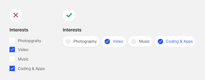
Why Chips Should Replace Checkboxes and Radio Buttons
Introducing chip components
Traditional checkboxes and radio buttons have become a thing of the past. They’re outdated and have lousy usability. Their tiny targets are hard to click with accuracy. The difference between a dot and checkmark cue can confuse non-tech-savvy users. The next evolution of checkboxes and radio buttons is chips.
Easier to Click and Tap
Radio buttons and checkboxes have small target zones without visible target borders. They’re hard for users to tap because the finger doesn’t fit inside the target zone.
Chips have a larger target zone with distinguished borders, making them easier to hit on desktop and mobile devices. The user can see the target clearer and hit it with higher accuracy.
Once users click or tap a chip, they’ll see a selection cue. A checkmark signifies multi-select behavior. A thicker outline signifies single-select behavior. The distinct style of the cues indicates different affordances.


