
Stop Making Users Scroll Long State and Country Menus
Reducing task time and user effort
When users fill out a form, they want a quick and smooth experience. Any friction can cause frustration, errors, or form abandonment.
Two form fields that often give users trouble are State and Country. Users struggle with these fields because they have to scan and scroll through a very long select menu.
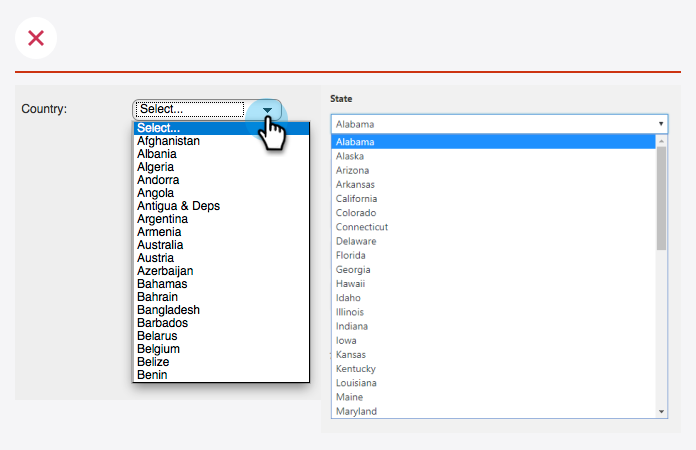
To get an idea of how long these menus are: there are 195 countries in the world and 50 states in the United States. Do you really want to make your users scroll through that many items to complete a form?
If you want to make your form easier to fill out, avoid using native select menus for State and Country fields. Instead, offer users a select menu with an autocomplete search.