
Your data table might look great on large desktop screens, but how does it look on small mobile screens? If you're not using the proper layout, chances are your table isn't easy to view. Most designers don't know what's optimal, but this article will reveal everything.
If you don't fix how you display your table on smaller screens, users won't be able to work efficiently from their mobile devices. They'll struggle to access the data they need when they need it. Therefore, a table accessible only on desktop screens limits users' ability to perform tasks.
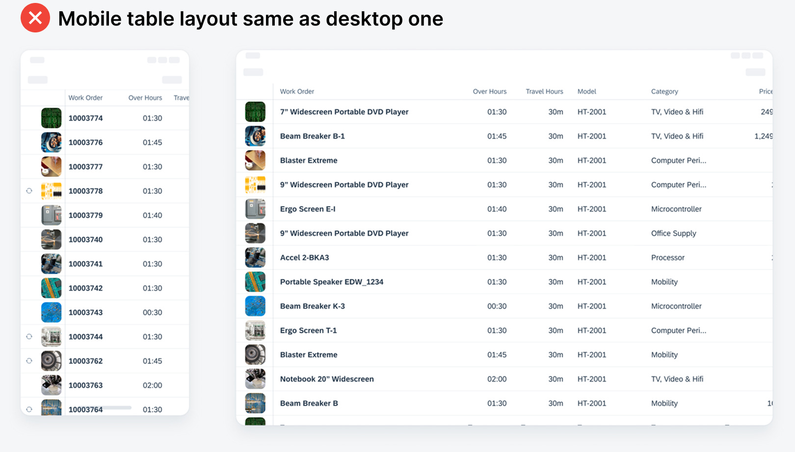
The typical mistake designers make is using the same table layout on mobile screens but with added horizontal scrolling. This approach is a poor user experience because it requires users to exert physical and cognitive effort to view multiple columns for each record. Luckily, there's a better approach where users can scan all the columns without the extra workload.