The Best UX Design for a Long List of Filters
Prioritize content over controls
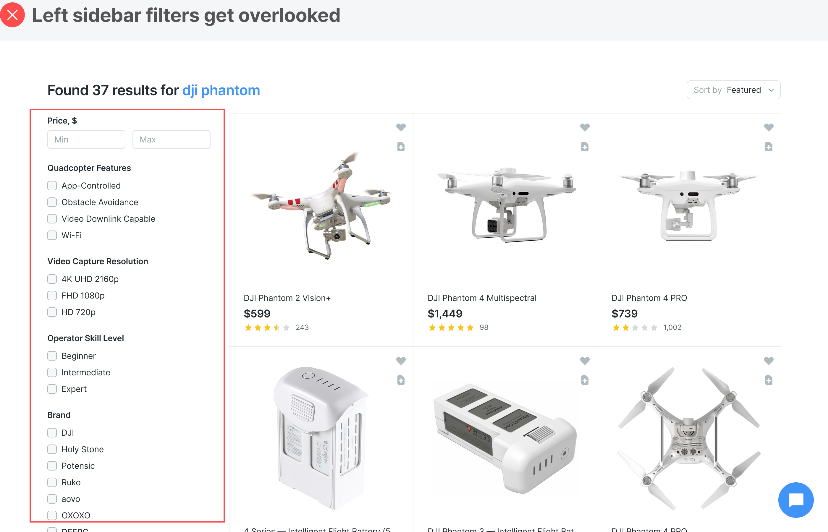
Every designer wants to know the best way to display a long list of filters. The most common design pattern is the left sidebar. However, it has user experience issues many designers aren't aware of.
Users often overlook sidebar filters because they're not in a location where they expect to find them. If they do spot them, they'll only look at the filters at the top above the page fold. As a result, the filters below the fold don't get much interaction. A left sidebar is a poor way to display a long list of filters.