The Biggest UI Mistake on Creation Forms
Designing for different post types
Creating new content on an interface isn't always a straightforward process. It starts with users clicking the "Create" button and filling out a form. However, filling out a creation form can be challenging when multiple content options exist.
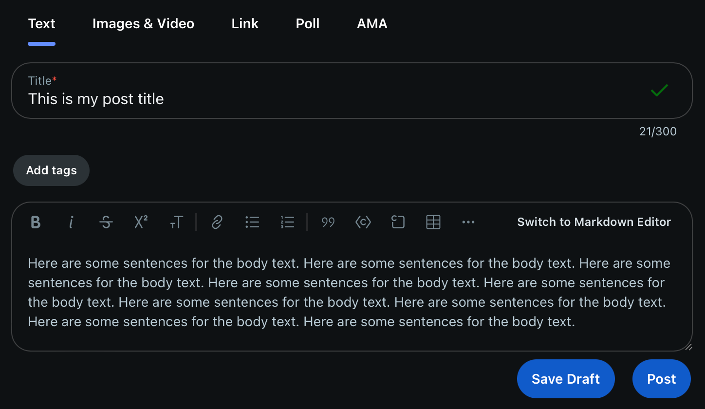
Users often end up clicking the wrong option and creating incomplete content. Then they get frustrated and have to delete their post and start over. A place where you can find this UI mistake is Reddit's creation form. Notice all the content options at the top in the tabs. It may seem straightforward, but can you see where users make their mistake?