UX Movement Newsletter

UX Movement Newsletter

Share this post

UX Movement Newsletter
The Optimal Spacing for Dropdown Menus

The Optimal Spacing for Dropdown Menus

Improving menu item labels

Aug 04, 2022
∙ Paid
21

Share this post

UX Movement Newsletter
The Optimal Spacing for Dropdown Menus
Share

Many dropdown menus are hard to use. They have poor usability due to the lack of spacing between menu items. A common mistake is only to provide spacing for the item cells but nothing else.

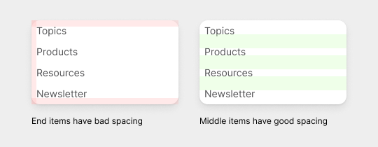
This example shows a menu with four items and four cells with equal spacing. While this seems reasonable, a dropdown menu needs more spacing than that for optimal readability and touchability.

Notice how the labels for the top and bottom items are too close to the top and bottom edges. As a result, those labels become harder to click and read than the middle ones.

This post is for paid subscribers

Already a paid subscriber? Sign in
© 2025 Anthony from UX Movement
Privacy ∙ Terms ∙ Collection notice
Start writingGet the app
Substack is the home for great culture

Share