
The Right and Wrong Way to Design a Multi-Column Form
Optimal form layout
The belief that multi-column forms have bad UX is a big fat myth. Many believe that single-column forms are better, but this isn't always true.
A single-column form with many data fields makes the page super long. When users see a lengthy form, they know it'll take time and effort to fill out. This makes them abandon the form, resulting in a lower conversion rate (source).
It's important to understand the right and wrong ways to design a multi-column form. If you misdesign it, it'll undoubtedly have bad UX. But if you design it correctly, it'll have better UX and a higher conversion rate than a single column form.
The Wrong Way
When the logical flow order of your fields is vertical, users tend to skip fields accidentally. They'll fill out a few fields in one column and jump to the next column without finishing all the fields in the first column. Sometimes they may even skip an entire column.
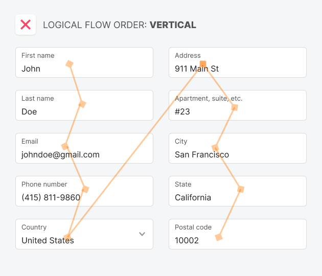
A possible reason users behave this way is that the relationship between each field isn't apparent when they're stacked vertically. As a result, users will jump around the form without following the intended flow order.