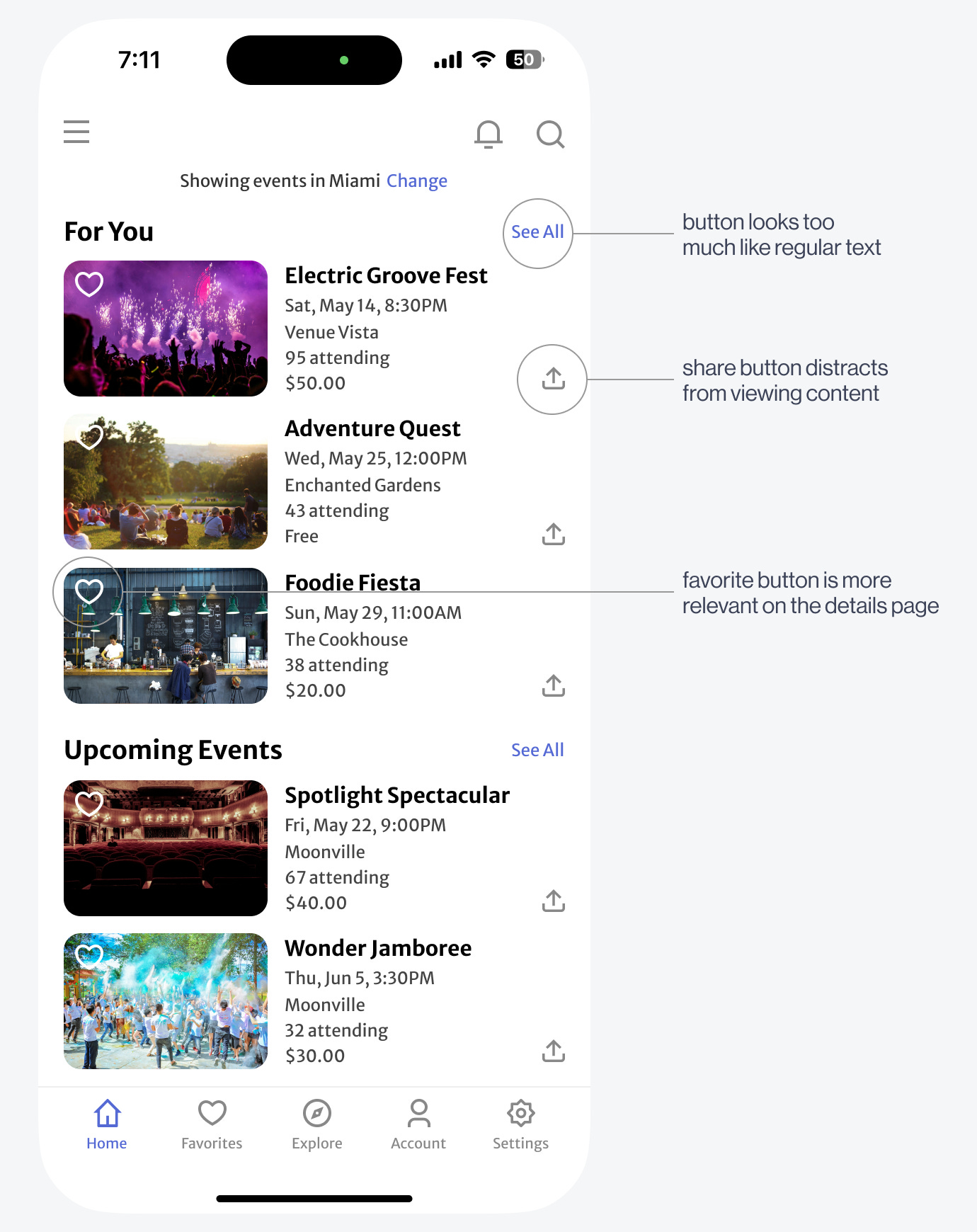
The content has three button actions: sharing, favoriting, and "See All." To get users to notice and click the "See All" button, it needs to look more interactive and less like text.
Another issue with the design is that the favorite and share buttons distract users from viewing the events. While reading the information, users must also evaluate what those buttons do and decide whether to click them, increasing cognitive load.
To make the "See All" look like a button, an all-caps treatment, and a disclosure arrow icon can signify its affordance. When users perceive it, they'll interpret it to mean "view all content in this category."


