This 2-Column Grid Will Make Your Form Fields Responsive
Form design for mobile screens
One of the biggest usability issues with forms is when they’re not responsive to mobile screen sizes. Users will see a partial view of the fields, with the rest cut off by the screen edge. Needless to say, this isn’t the most pleasant experience when filling out a form.
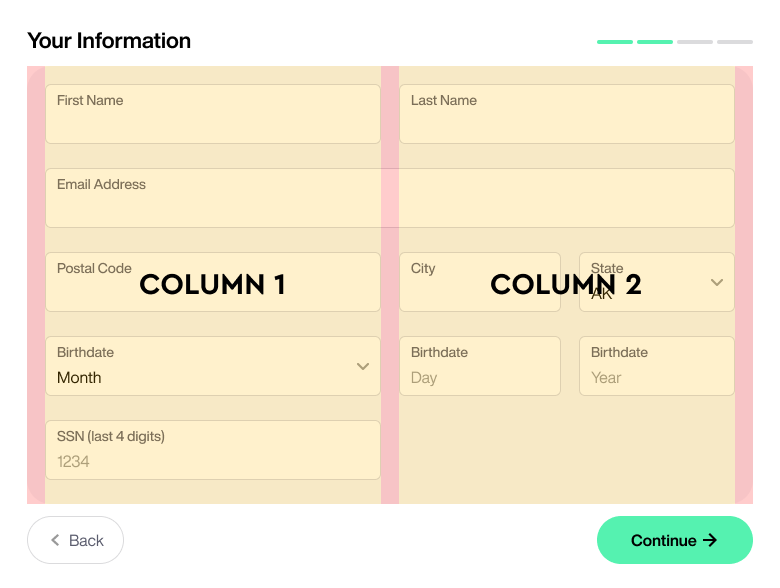
You can provide users with a full and consistent view of every field across all devices by using this 2-column form grid. This grid is easily dividable, so all your fields can fit comfortably on a mobile screen.