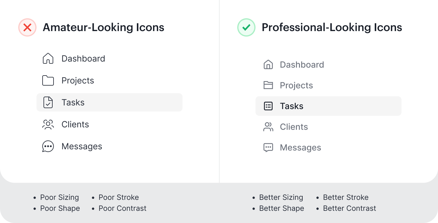
UI Design Tips for Better Looking Icons
Amateur vs Professional Icons
Not many designers pay attention to the user experience of their icons. Most of them will find a standard icon set and select a few that fit their interface. However, this isn't enough, because you also need to optimize the visuals so that the icons look cohesive and professional.
To use an analogy, it's like wearing a tailored suit compared to an off-the-rack suit. A tailored suit offers a superior fit and appearance because it's customized to the individual. In other words, it's essential to tailor your icons rather than settle for off-the-rack icons.
This article will show you how to turn amateur-looking icons into professional-looking ones. You'll learn how to optimize the sizing, shape, stroke, and contrast of your icons for a more refined and polished aesthetic.