


How Apple Should Fix Their Inaccessible Button Labels
Making call-to-action buttons more accessible
You may not have noticed this, but many apps and websites use white text labels on their buttons. Designers love using white labels on colored buttons because the white makes the text label pop against the background.

However, using white button labels can sometimes get you in trouble. Apple’s Facetime app has this problem with its green buttons. As you can see, the white text label isn’t legible or accessible. Users with visual impairments will experience the worst of these adverse effects.
It’s surprising how a powerhouse design company like Apple overlooked such a glaring issue. At the same time, it’s not surprising because many designers tend to use white button labels without much thought.
Apple is using their neon green brand color, but it’s not even close to accessible. Its accessibility ratio is about a 1.3, which is well below the minimum requirement of the 4.5 ratio. It’s for this reason that you shouldn’t always use your brand color on buttons (article).
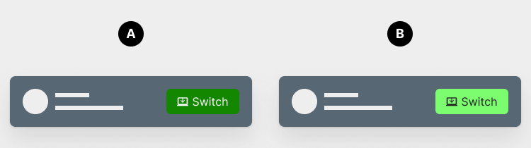
A white text label could work if the green were darker, but that would decrease the visibility of the button surface. In exhibit A, you can see how the dark green doesn't have enough contrast against the dark background of the notification, which makes the button imperceivable.
The challenge is for the button surface and text label to have enough contrast. However, the text label is more important because it requires reading and contains the information. That’s why the accessibility requirement is stricter for labels than interface elements.
If Apple wants the neon green button to work, they must use a black text label like the one in exhibit B. The black would make the text legible and the button surface perceivable at the same time. For this reason, exhibit B is the best option. The only drawback is that the label wouldn’t pop with luminance like a white one.