
Why Data Entry UX Is Killing Your Dashboard
What data presentation UX looks like instead
Your dashboard is failing users if it looks like a Word document or Excel spreadsheet. Unfortunately, most look like this because designers often design with a data-entry mindset. They display the data like they’re entering it in a form. This results in text floating on the page, with nothing to contain or structure it. In other words, there are no visual elements to present it in a palatable way.
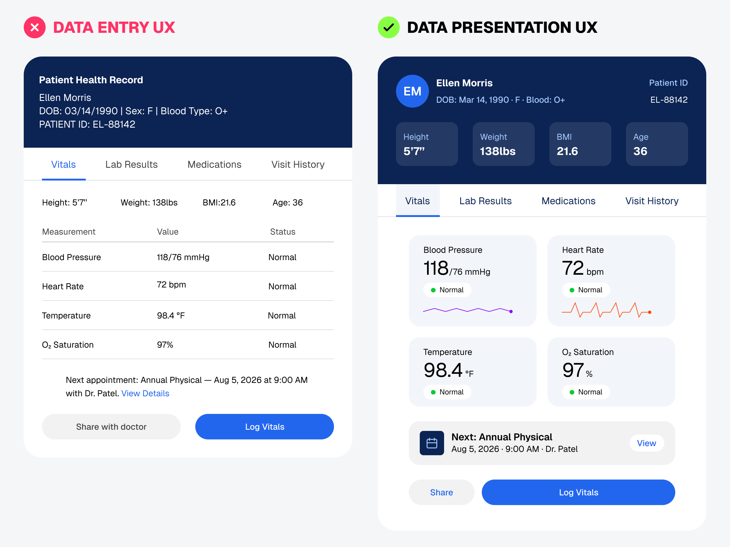
Users don’t want to feel like they’re reading a document or spreadsheet when using your dashboard. Instead, they want to feel like they’re experiencing a slide deck presentation where data is arranged, sized, and styled with intention.
Think of data presentation UX the way you think of a good slide deck. Nobody puts raw table data on a PowerPoint slide and calls it done. They turn it into a chart, a callout, or visual hierarchy. Your dashboard deserves the same treatment.
