Why Horizontal Lists Are Better for Mega Menus
Optimizing item list navigation
The way most designers think about menus is a vertical list. However, it's time to rethink this pattern for mega menus because they're suboptimal for finding and navigating items.
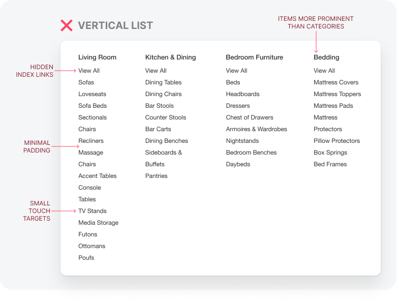
Packing many vertical lists in one menu is overwhelming and makes items harder to find. Before users can scan any items, they need to find the correct category. However, category titles are harder to find when the items dominate the visual field.
When users first look at a mega menu, they get bombarded with items galore. The category titles don't pop out immediately because the column layout constrains the text size, so it doesn't run into adjacent columns.
The index links to "view all" are also hard to see because they're mixed in the list. As a result, they often get overlooked as an item.
In addition, selecting each item is difficult because the padding between them is minimal. Users can accidentally click an adjacent item if they're not precise with their finger or mouse. Adding more padding wouldn't solve this and would only extend the lists vertically and make the menu too big.
The answer to mega menus isn't to use vertical lists and a column layout. In fact, it's just the opposite. Using a horizontal list and dividing each category into rows improves menu display and navigation.


