
Why Multi-Color Charts Are Inaccessible
Designing for the colorblind
Many interfaces use charts to help users visualize data. But unfortunately, most of those charts are inaccessible to the colorblind. Colorblind users cannot differentiate the data marks if your chart uses multiple colors.
Below is a bar chart with different colored marks. Users with red-green color blindness (deuteranopia or protanopia) will have trouble distinguishing three of the four data series because the colors are too similar.
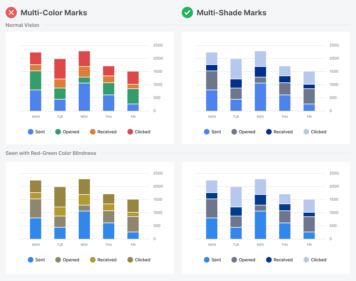
To make your charts accessible to colorblind users, don’t use different hues. Instead, use the same hue but vary the saturation and brightness. Doing this will create various shades of the same color with a preserved contrast. As a result, colorblind users will be able to differentiate the marks just as easily as normal-visioned users.
