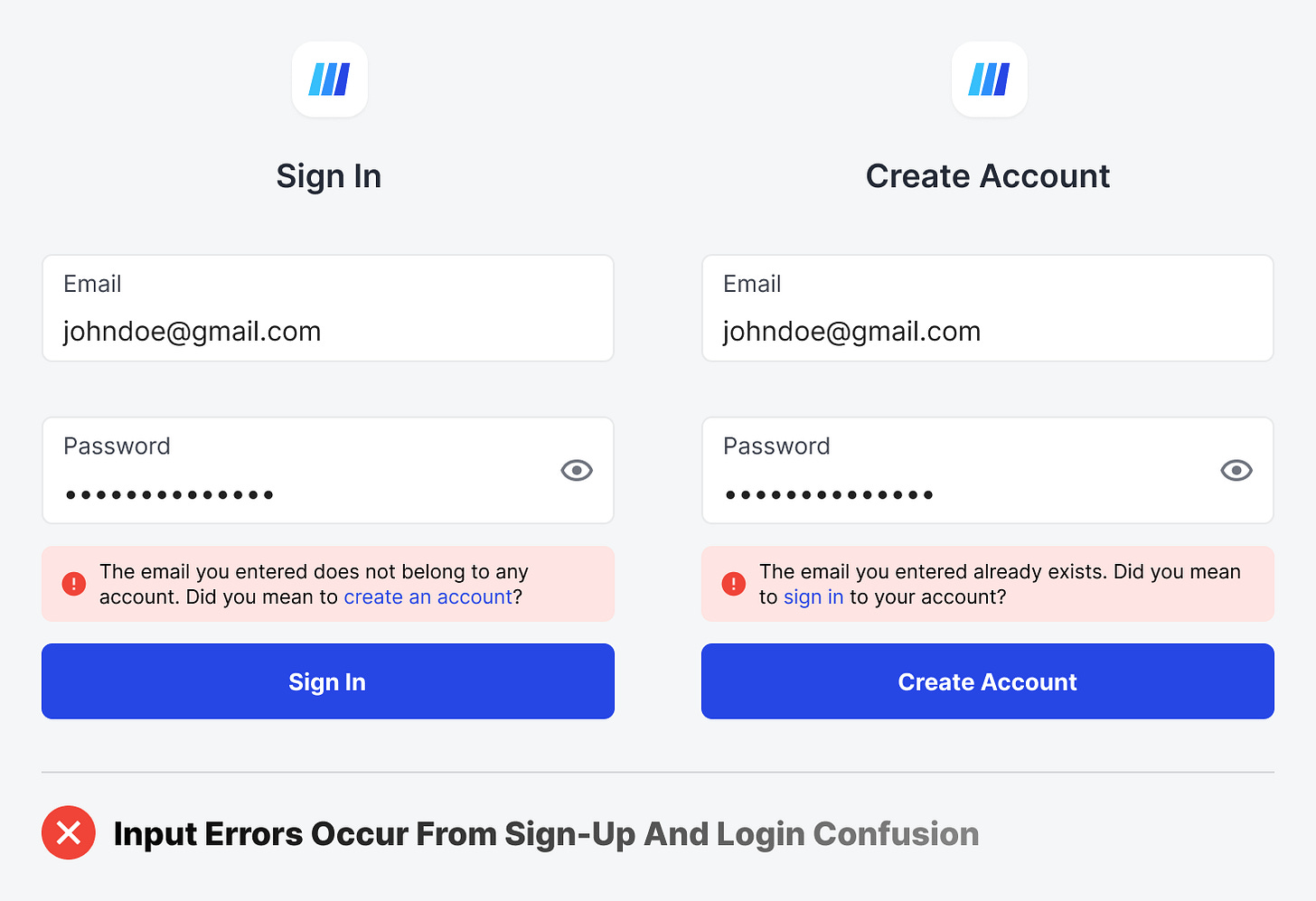
You may not be aware, but your sign-up and login forms are causing users to make preventable input errors. This is not due to having a difficult or confusing field to fill out but rather having your sign-up and login forms on separate pages.
When users land on the homepage of your app, they'll either choose to sign in to their existing account or create a new one. If they aren't paying attention, they could click the wrong button and end up on the wrong form. However, this won't be evident to them because the forms appear identical.
Since it's not immediately apparent that they're on the wrong form, users will attempt to sign up on the login form or even log in on the sign-up form. This results in input errors they didn't expect.


