Why You Shouldn’t Use Your Brand Color on Buttons
Optimizing call-to-action buttons for all users
Many apps use their brand color on their call-to-action buttons. Doing this may seem like a harmless act of branding, but it can actually hurt the user experience. Brand-colored buttons can lead to inaccessible text labels, button state conflicts, and a lower clickthrough rate.
Inaccessible Text Labels
Brand-colored buttons often have inaccessible text labels. Many brand colors are chosen without any consideration to accessibility. Instead, they’re chosen based on what looks most appealing on a logo. When that same brand color is applied to buttons, the text labels become difficult for visually impaired users to read.
If a brand’s primary color is orange, making call-to-action buttons orange would render the label inaccessible. For example, applying Home Depot’s orange to a button would give it a color contrast ratio of 3.0. The ratio for optimal accessibility is 4.5. This button color would cause issues for visually impaired users.
Button State Conflicts
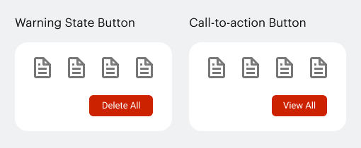
Red is a special color on buttons because it’s used to signify a warning state. Buttons that have destructive actions for deleting data are red to warn users of potential danger.
If your brand color is red, making your buttons the same color could conflict with any destructive actions on the interface. Users could click a dangerous action under the impression that it’s a regular action and delete data accidentally.
Conversely, regular actions that are red could cause concern. Users might hesitate to click a red call-to-action button if they’ve already experienced a destructive action.


