UX Movement Newsletter

UX Movement Newsletter

Share this post

UX Movement Newsletter
Why Your Buttons Should Have a Max Border-Radius

Why Your Buttons Should Have a Max Border-Radius

Shape contrast for buttons

Jun 08, 2021
∙ Paid
17

Share this post

UX Movement Newsletter
Why Your Buttons Should Have a Max Border-Radius
1
Share

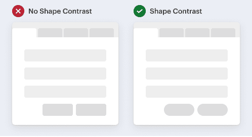
Most interface elements have a boxy shape. Think of text fields, menus, cards, modals, and buttons. The problem with this is that it causes buttons to lose shape contrast.

Buttons should always stand out more than other elements because users need to interact with them to progress their tasks. They should not only have color contrast but shape contrast a…

This post is for paid subscribers

Already a paid subscriber? Sign in
© 2025 Anthony from UX Movement
Privacy ∙ Terms ∙ Collection notice
Start writingGet the app
Substack is the home for great culture

Share