Timelines: Bring Your Chronological Data to Life
A better way to display progress
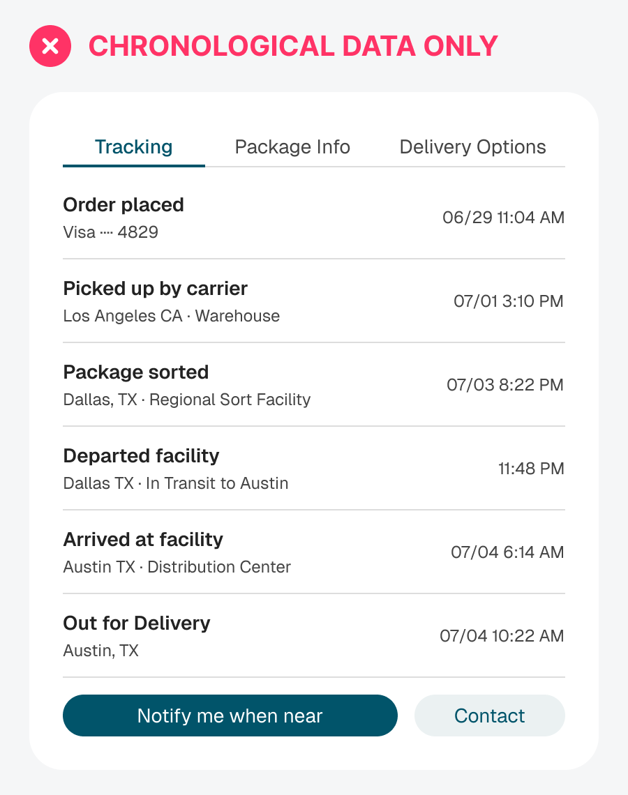
Not all data is the same. When it comes to chronological data, don’t use dense lists and tables to display it. Doing so only leads to higher cognitive load and a confusing context.
For example, this shipping UI displays the tracking details for a package. When you read it, it looks like a regular list of items. It’s only after you see the timestamps that you realize this is chronological data about the delivery progress.