The Padding Trick for Easy to Click Radio Buttons
Say goodbye to tiny touch targets
Radio buttons today look the same as they did many years ago. The problem is that designers have not improved the user experience since then. It's time to update the design of radio buttons and make them faster and easier to click.
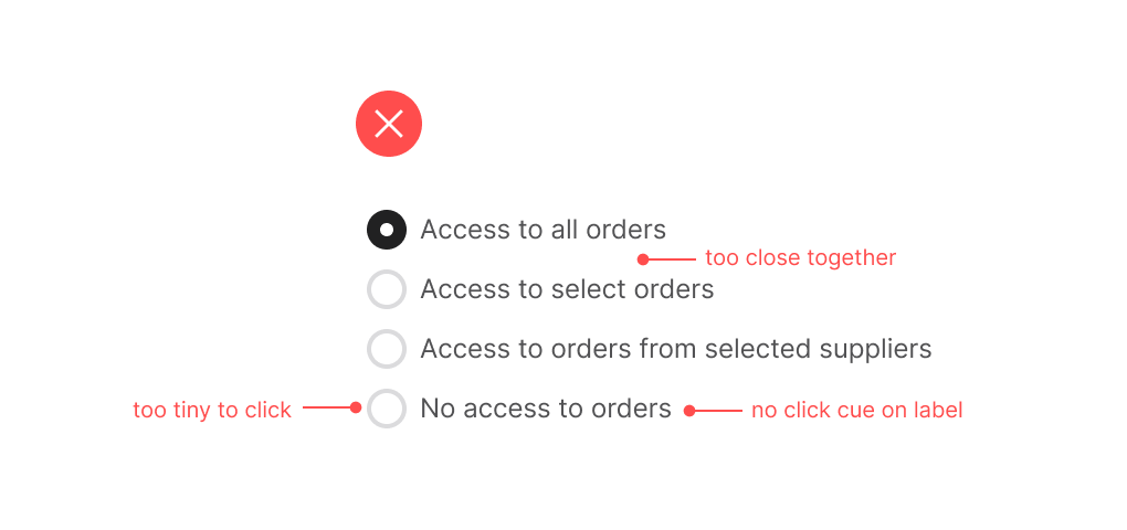
They have small touch targets that make them hard to click accurately. Most users will try to target the radio button, not knowing they can click the label because there's no visual cue to indicate the label is clickable.
Also, radio buttons are often placed too close to each other in a list. As a result, users can misclick the wrong option and accidentally hit an adjacent one. These misclicks result in slower task performance and user frustration.