The Right Way to Design Table Status Badges
Design better status badges
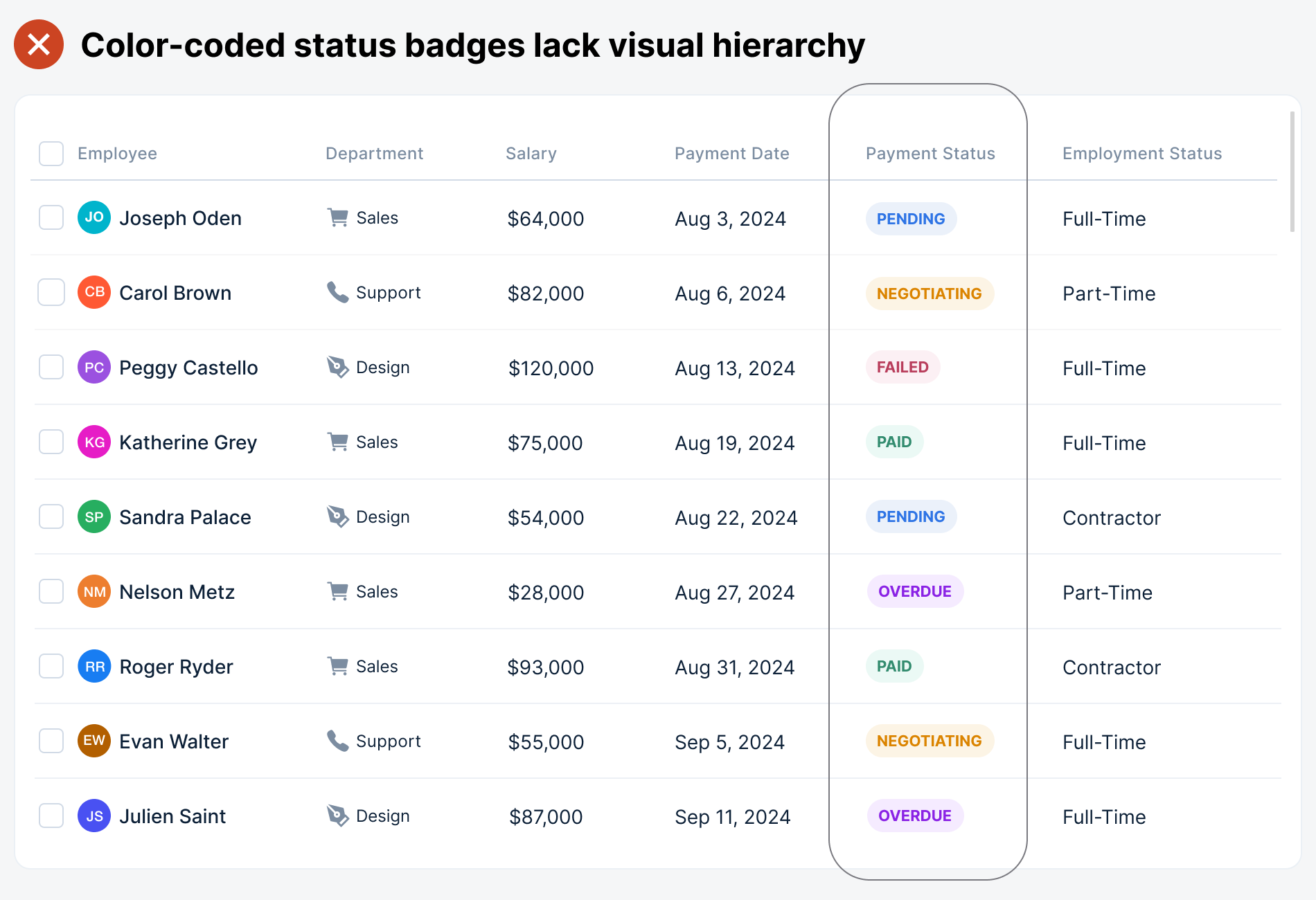
Almost every table uses badges to indicate different statuses to users. Status badges alert them to which specific data they need to act on or be aware of. However, a big UX problem is that it's hard to differentiate the meaning and priority of these statuses.
The typical approach is to color-code each status so that users can associate a particular color with it. However, this doesn't work when there are too many colors and statuses. The status column looks like a pixelated rainbow and sacrifices efficiency for aesthetics.
When the badges are too colorful, they all compete for attention. As a result, it's hard to recognize which data requires immediate action, causing users to miss essential updates. This badge design fails to alert users and needs improvement.