A way to make your text fields easier to scan is to vary the font weight between the field label and input. However, it’s not evident what the optimal font weight pairing is.
One thing is for sure, the input is higher priority than the label and needs to have more contrast. But that begs the question of how much contrast both should have relative to each other. What do you think?
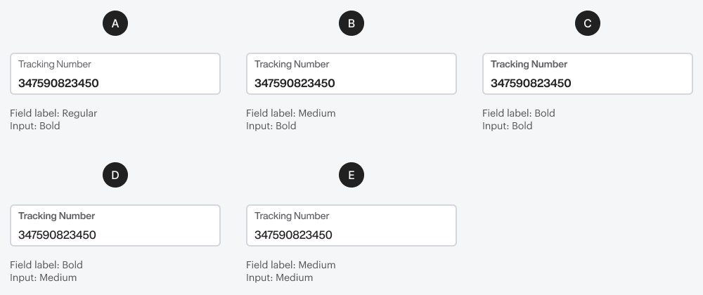
Although A was a close second for me, as I thought it had an understated quality, B was the best combination and placed emphasis on the most important text field, especially if selecting the number to copy and paste elsewhere.
Other variables present, but not included in discussion are font size, font type, background, spacing between label and input, input type, columns on the page, and number of fields, sections in form. If the Input has a higher font size than the label, then it has more weight in which case medium / medium almost works, but not enough. I prefer higher contrast showing both larger type by 2-3 points plus 1 weight higher say regular/medium or medium/bold. Our users need to be able to make sure they filled in the data correctly by checking their work before submitting.


Although A was a close second for me, as I thought it had an understated quality, B was the best combination and placed emphasis on the most important text field, especially if selecting the number to copy and paste elsewhere.
My hypothesis was B
Font contrast needs improvement. Spacing issues make it less readable. Large labels with tiny text aren't effective.
Other variables present, but not included in discussion are font size, font type, background, spacing between label and input, input type, columns on the page, and number of fields, sections in form. If the Input has a higher font size than the label, then it has more weight in which case medium / medium almost works, but not enough. I prefer higher contrast showing both larger type by 2-3 points plus 1 weight higher say regular/medium or medium/bold. Our users need to be able to make sure they filled in the data correctly by checking their work before submitting.
I believe that D has the best balance for readability the previous 3 are too bold and letter spacing is too tight for this weight of font.