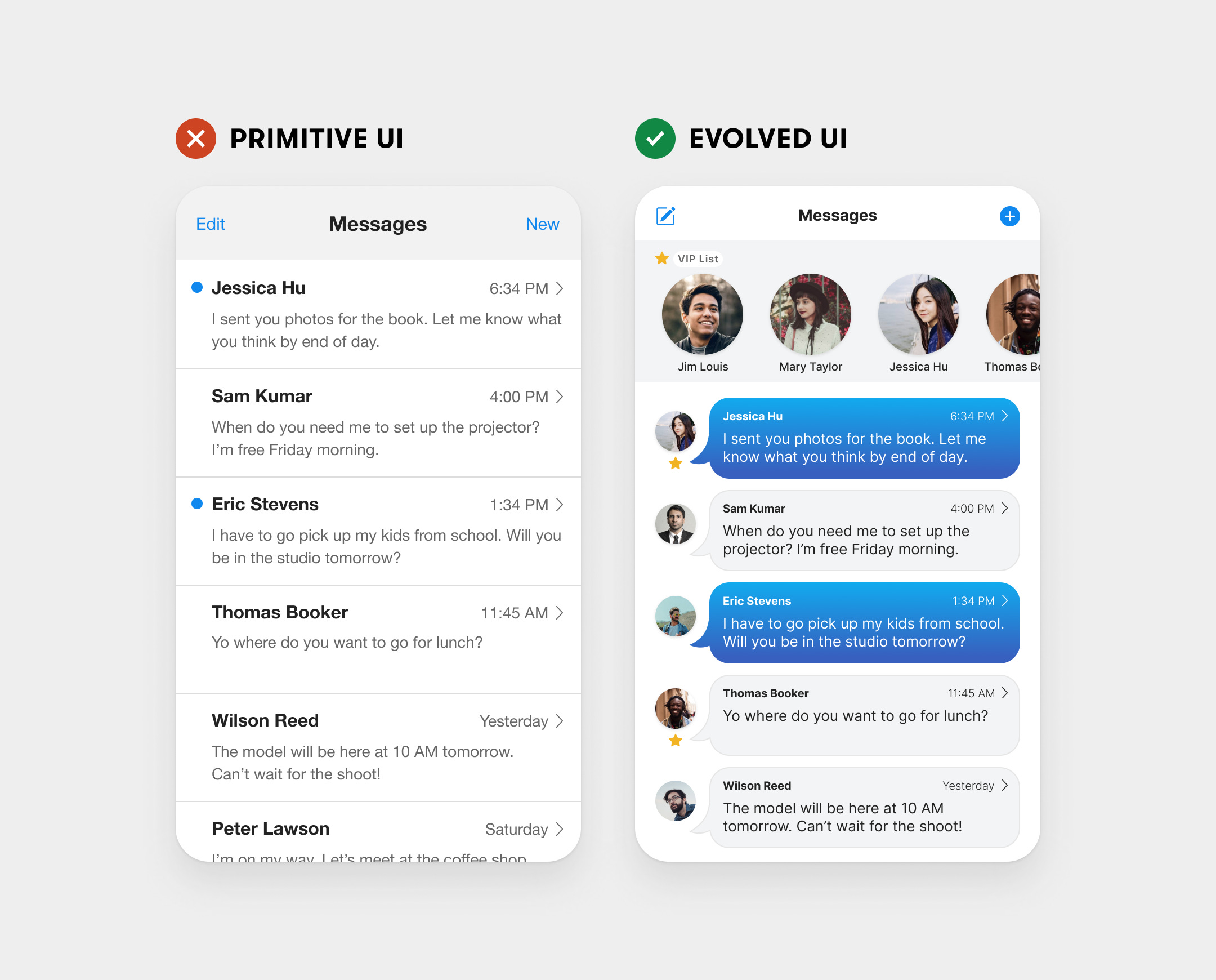
The primitive way to display interface information is to use lines and boxes. This approach usually gets the job done, but something is still missing. Such a primitive UI feels dull, flat, and rudimentary. Is this the best user experience one can design?
Designers should aim for an evolved UI beyond simple lines and boxes. The messages app brings the messaging motif into the UI by using message bubbles, and avatar faces to display the data. As a result, users can recognize the nature of the information at a glance.
Rather than displaying information in a list, the app prioritizes the data based on the user’s needs. For instance, it allows users to create a VIP list to find a person’s messages immediately rather than scrolling through the entire list.
The primitive UI looks and feels underdeveloped and unfinished, while the evolved UI looks and feels more like a complete messaging app at its peak stage. What are your thoughts on this new way of thinking?
Looks can be deceiving. I would love to see some testing done on this - not just a poll about which looks better, but how quickly and correctly can it be read and processed.
The 'developed and finished' version:
- tiny indistinguishable photos of people that are all low contrast, etc. and much smaller text for their names on lower contrast backgrounds.
- less white space
- fewer things on the page - i.e. if the test is "what does the text from xyzzy say", for me its way faster to find the well spaced bold name on the left.
Again, it would be fascinating to actually test the performance of this, depending upon the clearly established criteria. True usability testing, not just A/B. But eye tracking, response time, recall, etc. Certainly, 'looks nicer / feels nicer' could be a valid criteria to evaluate, but just glancing at this the readability of the primitive is far superior (to my eyes / viewing environment / etc.). But different people may have vastly different usage criteria for their messaging environments too.
I subscribed so I could comment on this... I forgot to mention that in the "Evolved" example it moves from the words "Edit" and "New" to icons. However, whomever evolved the edit icon doesn't seem to know that it is essentially the same icon that at least Apple uses for "New" when it involves writing - new mail, new message, etc. all use this square with a pencil. Not to mention it's unclear what "Edit" means in this context? Is deleting conversations one of the top 2 things you need to do in a messaging list?
I agree. There are groupings of content that would be better displayed in a certain way that best represents it
Usually that representation would have some benefit such as a faster read or better formatting. One example is showing a flight from 2 cities. You could put that as text in a data table with columns but a form most people commonly see is the airport code connected by a horizontal line. Any other information elements or stylings on top of that is considered juice in my opinion. (https://garden.bradwoods.io/notes/design/juice)
The biggest challenge I've been facing lately is trying to find an optimal representation for information groupings that are non-traditional or less commonly used in either consumer applications and more geared for enterprise or internal use cases.


Looks can be deceiving. I would love to see some testing done on this - not just a poll about which looks better, but how quickly and correctly can it be read and processed.
The 'developed and finished' version:
- tiny indistinguishable photos of people that are all low contrast, etc. and much smaller text for their names on lower contrast backgrounds.
- less white space
- fewer things on the page - i.e. if the test is "what does the text from xyzzy say", for me its way faster to find the well spaced bold name on the left.
Again, it would be fascinating to actually test the performance of this, depending upon the clearly established criteria. True usability testing, not just A/B. But eye tracking, response time, recall, etc. Certainly, 'looks nicer / feels nicer' could be a valid criteria to evaluate, but just glancing at this the readability of the primitive is far superior (to my eyes / viewing environment / etc.). But different people may have vastly different usage criteria for their messaging environments too.
I subscribed so I could comment on this... I forgot to mention that in the "Evolved" example it moves from the words "Edit" and "New" to icons. However, whomever evolved the edit icon doesn't seem to know that it is essentially the same icon that at least Apple uses for "New" when it involves writing - new mail, new message, etc. all use this square with a pencil. Not to mention it's unclear what "Edit" means in this context? Is deleting conversations one of the top 2 things you need to do in a messaging list?
What if the last message belongs to me? I didn’t see an example
I agree. There are groupings of content that would be better displayed in a certain way that best represents it
Usually that representation would have some benefit such as a faster read or better formatting. One example is showing a flight from 2 cities. You could put that as text in a data table with columns but a form most people commonly see is the airport code connected by a horizontal line. Any other information elements or stylings on top of that is considered juice in my opinion. (https://garden.bradwoods.io/notes/design/juice)
The biggest challenge I've been facing lately is trying to find an optimal representation for information groupings that are non-traditional or less commonly used in either consumer applications and more geared for enterprise or internal use cases.