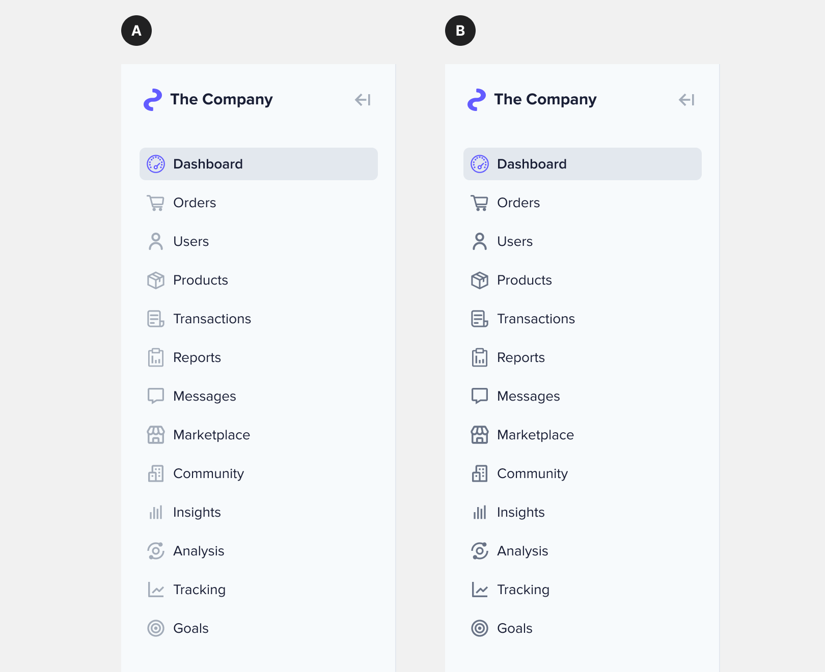
How many of you look at the icon when scanning for an item in a sidebar? I have a sneaking suspicion that most users ignore the icons and only look at the text labels when trying to find an item. Not using the icons is a waste of beautiful and aesthetic cues.
I thought that making the icons darker would allow users to pay more attention to them when searching for an item. As a result, it’ll create a stronger association between the icon and label the more times they see it. At the same time, I was concerned that the dark icons would be too distracting. What do you think?
I prefer B. The icons serve more as a decorative choice to enhance look and feel, than fulfilling a functional role in this case.
Secondarily, the darker icons are easier on the eyes due to the higher contrast. The older the eyes looking at it, the more a higher contrast is needed and appreciated.
Revisiting this more than a month later, and besides all the other reasons people have given (and I mostly agree with the ones supporting the choice for "B"), I don't think you should have to adjust the icons when collapsing the menu and the lighter icons won't work as well in the collapsed state.
Having icons in a slightly different color helps scannability, because icons become more supportive.
Users might not scan by using icons, but I bet removing them will make selecting the searched for item longer in terms of time. Visuals help.
The tone of grey might be a little too light for some users, but as the icon is only supportive, the dark grey used for text is enough for accessibility purposes.
Dark is the way to go; why? because it creates a visual unity with the text (plus, they notice more, more contrast is always good for people who need to see it). Light has higher cognitive visual load.
I didn't notice the difference at first, second, or third glance. It wasn't till I read the explaining text that I realized that the second set of icons is darker. People are going to need to read the words first. Anything you do to make that more difficult is going to hinder their ability to scan. The icons are there to provide visual interest so that people feel better about scanning the list. And of course, as they become more familiar with the icons they'll be able to collapse the panel and still find what they need easily. It's only after the icons are associated with the text (in this specific content) that the icons become useful.
Tough to gauge entirely without knowing the screen context.
I lean towards A in this context because it's easier to focus on and read the text. Which, at the end of the day, is going to be the most reliable form of wayfinding of most applications. With that many icons, I'm not sure there's much backing the idea that people will remember what those mean in any significant way to navigate your product.
As others have said, your icons might be a little uneven for a fair comparison, as well. Perhaps the dark one could work better if the icons were consistent and simpler. Right now they lack a visual rhythm that makes them identifiable as wayfinding icons and not generic iconography.
I think that it looks better with sidebar A, but I agree that it might be better to have the user associate the selection options more closely with the icons since it will make it easier to use the collapsed version.
Depending on the icon and even if you include a fair separation between icon and label, it can increase the cognitive load to interpret the meaning of each item.
E.g.: Insights and its icon could be interpreted similar to “iIiII Insights”


I prefer B. The icons serve more as a decorative choice to enhance look and feel, than fulfilling a functional role in this case.
Secondarily, the darker icons are easier on the eyes due to the higher contrast. The older the eyes looking at it, the more a higher contrast is needed and appreciated.
Sidebar A
Its easier and faster to read the text. The icon should support the text.
Users may have difficulty understanding what each icon represents.
Although I like the "look: of A, I find that B is more accessible for low vision readers.
Oh yeah another light grey icon and light gray text on white. Big Nope. Just give me a button that says "Bold" and I'll click it so I can read it.
it is hard to compare cus some icons have different stroke width
but I would choose the left one bc
- I would use the same "lighter" icons style in other components
- icons on the sidebar looks consistent with the "collapse panel" icon color-wise
Revisiting this more than a month later, and besides all the other reasons people have given (and I mostly agree with the ones supporting the choice for "B"), I don't think you should have to adjust the icons when collapsing the menu and the lighter icons won't work as well in the collapsed state.
B is more legible
Having icons in a slightly different color helps scannability, because icons become more supportive.
Users might not scan by using icons, but I bet removing them will make selecting the searched for item longer in terms of time. Visuals help.
The tone of grey might be a little too light for some users, but as the icon is only supportive, the dark grey used for text is enough for accessibility purposes.
Sidebar A.
Dark is the way to go; why? because it creates a visual unity with the text (plus, they notice more, more contrast is always good for people who need to see it). Light has higher cognitive visual load.
I'm in fact surprised so many people chose A.
Sidebar A.
I find B to be a better choice, one being the consistency of the look and a slight bit easier to read.
I really miss the option with:
a. regular icons
b. greyed out text
A圖標不會干擾文字的閱讀,算是輔助與裝飾兼具美感。但若我是非英文語系的人會需要B的圖標辨識,若選B我會希望圖標離文字再遠一點
"A" has less visual noise and visually prioritises the the words, icons then play a support role. This makes it faster and easier to comprehend.
But if you pent ages designing icons then you'd probably prefer them darker and bigger
Does it make a difference? Didn’t notice the diff at all.
I didn't notice the difference at first, second, or third glance. It wasn't till I read the explaining text that I realized that the second set of icons is darker. People are going to need to read the words first. Anything you do to make that more difficult is going to hinder their ability to scan. The icons are there to provide visual interest so that people feel better about scanning the list. And of course, as they become more familiar with the icons they'll be able to collapse the panel and still find what they need easily. It's only after the icons are associated with the text (in this specific content) that the icons become useful.
Dark. The active treatment is obvious. In this case clarity is more important than signaling an inactive state.
Tough to gauge entirely without knowing the screen context.
I lean towards A in this context because it's easier to focus on and read the text. Which, at the end of the day, is going to be the most reliable form of wayfinding of most applications. With that many icons, I'm not sure there's much backing the idea that people will remember what those mean in any significant way to navigate your product.
As others have said, your icons might be a little uneven for a fair comparison, as well. Perhaps the dark one could work better if the icons were consistent and simpler. Right now they lack a visual rhythm that makes them identifiable as wayfinding icons and not generic iconography.
Stronger, think about users with vision impairments, and if the icon is a good match with the label, it makes sense.
I'd choose B, for some reason it make the text more visible...and nope I still did not look at the icons...
I think that it looks better with sidebar A, but I agree that it might be better to have the user associate the selection options more closely with the icons since it will make it easier to use the collapsed version.
Depending on the icon and even if you include a fair separation between icon and label, it can increase the cognitive load to interpret the meaning of each item.
E.g.: Insights and its icon could be interpreted similar to “iIiII Insights”