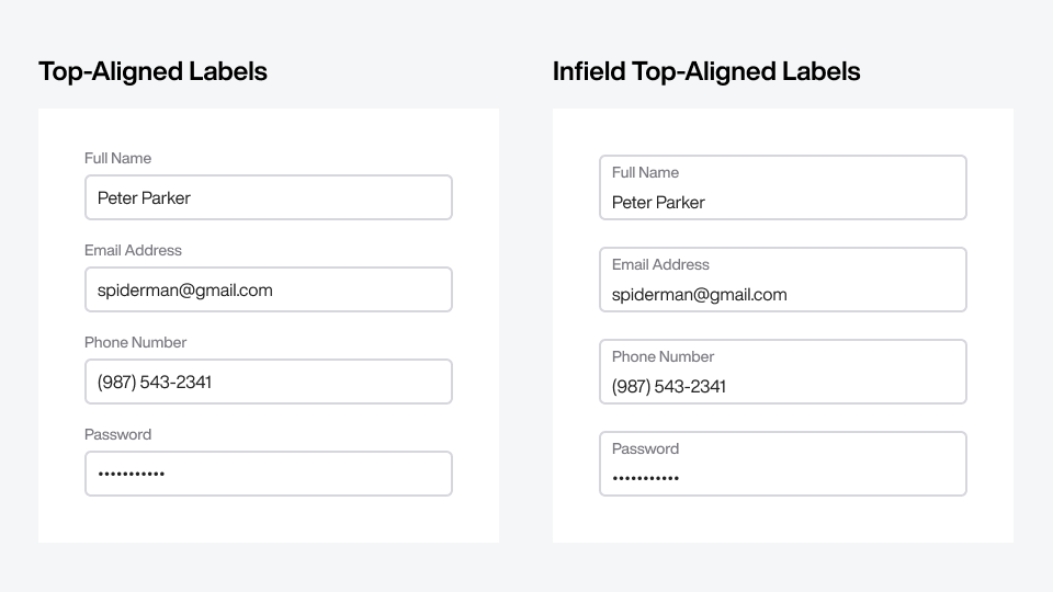
Field labels are the first thing users notice on forms. How you align them with your text fields affects cognitive load. I've shown that top-aligned labels incur a higher cognitive load than infield top-aligned labels.
Stronger label-to-field relationship
Fewer eye fixations when scanning
Easier to distinguish error/help messages
Faster to complete overall
However, I've noticed there are still many designers who still use top-aligned labels. Have you switched to infield top-aligned labels yet? Why or why not?
I'm open to trying the in-field labels, but they do rely on a stronger visual distinction between the label and field contents since the input border is no longer a clear delimiter.
In-field labels can also create the illusion of a "filled" input when it is actually empty. This is exacerbated by designs where the in-field label moves into a "placeholder" position/size when the field is empty.
The design where the infield label moves from placeholder to the top is called floating labels which I don't recommend. I agree that a stronger distinction is needed between input and label but this is easy to do with simple text styling. I plan to cover this in an upcoming article.
I'll write an article on error/help messages. But basically, it's easier to distinguish error/help messages because they're outside the field while the label is inside. The field border visually separates them. With top-aligned labels, both the label and error/help messages are outside the field.
If something is NOT broken, don't fix it. This applies to the problem in question. Top aligned labels are a norm, good for accessibility as well. I don't see a strong reasons in the rationales you've provided to change the user behaviour.
I haven't updated my existing designs yet, but I'm sold on the change.
I'm still not totally sure how best to go about including descriptions and error states with the infield labels, though—historically I've structured my fields (with outfield labels) as follows:
Label
Description
[ Field without placeholder text ]
Error icon + message (if any)
For example:
Full Name
E.g., Steve Jobs
[ 12345 ]
⚠️ Your name must contain at least 1 letter
It's certainly more fatiguing on the eye compared to infield top-aligned labels when all elements are present, but with infield top-aligned labels, I feel I have to make a tradeoff when including the same information: Either leave error states and/or descriptions outside the field and risk losing their visual association with the field, or bring them into the field and lose the clarity of the blank space representing the interactive area of the field itself. Is there an ideal approach here?
Thanks for bringing this issue up because it made me realize I haven't written an article on how to manage error and help messages yet. I'll be working on this.
It's definitely more eye fatiguing. Error/help messages should never interfere with the user's input text. Therefore, displaying them outside the field is best. However, the question is how to display all that text without breaking the layout or overwhelming the user.
In short, I believe they should be displayed below the field but never simultaneously. Help message stays persistent until the error message is triggered and takes precedence over it.
What happens when you need hint text for the field? Where does the error go? Perhaps in short forms of about 4 fields or so it works well but I don't think its flexible enough for every use case.
I'll offer that the design systems I have worked in are only as simple as the most complex form. So when adding in input descriptions (some of which may be long and have their own summary/detail expanders) and errors/validation messages, the visual hierarchy of the infield form label becomes challenging.
(for context, I work on government forms which have all sorts of statutory complexity. Also developer tools, which have their own weird widgets.)
I'll be interested in reading this, but if Ben's issue is the same as mine - we have forms where we are legally required to have fairly long labels (and have hence stuck with top -aligned.
interesting subject. Unfortunately on the UI I'm currently working on we're forced to have labels on the left of the widgets they belong to, for space reasons: it'd be great to have an article on that as well. Should the label column be left aligned or right aligned, for example? Since it's a desktop app we're talking about, what if the UI gets scaled horizontally? Wouldn't left aligned labels get too far away from the widgets they belong to?
Any suggestions for creating something like this with in-field or another alternative? If I have an in-field text input what would be the placement for a button next to that input?
The government project I'm supporting uses the USWDS style guide and component library, which has not yet moved forward to more modern, proven improvements like this. Hopefully soon.
Could someone share a link (or links) to the other articles discussing this issue? I'm not turning them up by searching the archive and I'd like to learn more about the research and thinking here.


I'm open to trying the in-field labels, but they do rely on a stronger visual distinction between the label and field contents since the input border is no longer a clear delimiter.
In-field labels can also create the illusion of a "filled" input when it is actually empty. This is exacerbated by designs where the in-field label moves into a "placeholder" position/size when the field is empty.
The design where the infield label moves from placeholder to the top is called floating labels which I don't recommend. I agree that a stronger distinction is needed between input and label but this is easy to do with simple text styling. I plan to cover this in an upcoming article.
How do you test these changes, live environment or user interviews? What tool do you use for eye fixations?
Eye tracking (https://en.wikipedia.org/wiki/Eye_tracking)
You didn't provide an example of an error/help message. How is the infield labeling help with error/help messages?
I'll write an article on error/help messages. But basically, it's easier to distinguish error/help messages because they're outside the field while the label is inside. The field border visually separates them. With top-aligned labels, both the label and error/help messages are outside the field.
I’m curious...How accessible are infield labels? Can screen readers read them?
Depends on how they're implemented. Here's how Bootstrap 5 does the markup, which should announce ok so long as the label is attached (for=) to the input: https://getbootstrap.com/docs/5.2/forms/floating-labels/
This is an awesome observation and question! Thanks for posting!
If something is NOT broken, don't fix it. This applies to the problem in question. Top aligned labels are a norm, good for accessibility as well. I don't see a strong reasons in the rationales you've provided to change the user behaviour.
I haven't updated my existing designs yet, but I'm sold on the change.
I'm still not totally sure how best to go about including descriptions and error states with the infield labels, though—historically I've structured my fields (with outfield labels) as follows:
Label
Description
[ Field without placeholder text ]
Error icon + message (if any)
For example:
Full Name
E.g., Steve Jobs
[ 12345 ]
⚠️ Your name must contain at least 1 letter
It's certainly more fatiguing on the eye compared to infield top-aligned labels when all elements are present, but with infield top-aligned labels, I feel I have to make a tradeoff when including the same information: Either leave error states and/or descriptions outside the field and risk losing their visual association with the field, or bring them into the field and lose the clarity of the blank space representing the interactive area of the field itself. Is there an ideal approach here?
Thanks for bringing this issue up because it made me realize I haven't written an article on how to manage error and help messages yet. I'll be working on this.
It's definitely more eye fatiguing. Error/help messages should never interfere with the user's input text. Therefore, displaying them outside the field is best. However, the question is how to display all that text without breaking the layout or overwhelming the user.
In short, I believe they should be displayed below the field but never simultaneously. Help message stays persistent until the error message is triggered and takes precedence over it.
Ah—good advice! Thanks very much, and my pleasure. I'll look forward to the future article and continue with your suggestion in the meantime.
I would like to see otheres opinion, when it comes to filter section.
Is it available on Filter section?
Not that I disagree with you or what you're saying is wrong, but how can you substantiate these claims:
"I've shown that top-aligned labels incur a higher cognitive load than infield top-aligned labels.
• Stronger label-to-field relationship
• Fewer eye fixations when scanning
• Easier to distinguish error/help messages
• Faster to complete overall
Aren't advantages of top align labels:
- the form is less daunting because it looks less busy
- it's immediately obvious what is filled out and what is not
What happens when you need hint text for the field? Where does the error go? Perhaps in short forms of about 4 fields or so it works well but I don't think its flexible enough for every use case.
I'll offer that the design systems I have worked in are only as simple as the most complex form. So when adding in input descriptions (some of which may be long and have their own summary/detail expanders) and errors/validation messages, the visual hierarchy of the infield form label becomes challenging.
(for context, I work on government forms which have all sorts of statutory complexity. Also developer tools, which have their own weird widgets.)
Long help text should go in a tooltip. I'll cover this more in the next article.
I'll be interested in reading this, but if Ben's issue is the same as mine - we have forms where we are legally required to have fairly long labels (and have hence stuck with top -aligned.
interesting subject. Unfortunately on the UI I'm currently working on we're forced to have labels on the left of the widgets they belong to, for space reasons: it'd be great to have an article on that as well. Should the label column be left aligned or right aligned, for example? Since it's a desktop app we're talking about, what if the UI gets scaled horizontally? Wouldn't left aligned labels get too far away from the widgets they belong to?
I am having trouble finding an example with the in-field input but with a button addon or button trailing. For example: https://getbootstrap.com/docs/4.0/components/input-group/#button-addons
Any suggestions for creating something like this with in-field or another alternative? If I have an in-field text input what would be the placement for a button next to that input?
The right side of the field should be reserved for icons or buttons. Icons fit well but if you put a button there you'll have to size it accordingly.
Here's an article about infield icons: https://uxmovement.substack.com/p/use-input-tray-icons-for-dynamic
So both cases are beautiful, but in the one on the right, where do you place the arrow, at the bottom, in the center?
What about other form components such as Dropdown and checkbox list? Do you also inclused them in the box?
The government project I'm supporting uses the USWDS style guide and component library, which has not yet moved forward to more modern, proven improvements like this. Hopefully soon.
Could someone share a link (or links) to the other articles discussing this issue? I'm not turning them up by searching the archive and I'd like to learn more about the research and thinking here.
Never mind! I found it on Medium: https://medium.com/@uxmovement/why-infield-top-aligned-labels-beat-floating-labels-c884c1499da5
Made the switch to infield Top-Aligned Labels after coming across your articles 👍🏼👌🏼❤️